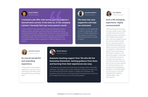
Responsive Landing page using Css Grid

Solution retrospective
I am proud of the responsive design and clean layout achieved with CSS Grid and Tailwind CSS. Implementing a grid that adapts well across different screen sizes and adding subtle interactive effects (like hover scaling) brought a polished look to the project. I’m also happy with how I used React to make the component structure modular and data-driven so that it can be reused or adapted to different content in the future.
What challenges did you encounter, and how did you overcome them?Creating a Responsive Grid Layout: Initially, setting up the CSS grid to be both flexible and visually consistent across screen sizes was challenging. Adjusting grid properties like grid-template-columns and using responsive classes in Tailwind CSS required some experimentation. I overcame this by iterating on different column spans and row heights and utilizing Tailwind’s responsive utilities (sm:, md:, lg:) to control the layout for various breakpoints.
Maintaining Consistent Styling with Tailwind CSS: Tailwind’s utility classes made styling quick, but at times, it became difficult to keep track of classes and maintain a consistent design. I tackled this by creating a reusable style template for the grid cards and defining color variables for each grid item to keep the look cohesive.
Working with SVG Icons in React: Integrating SVG icons directly in React posed some syntax challenges, as SVG attributes like fill-rule needed to be converted to camel case (e.g., fillRule). I solved this by researching proper JSX syntax for SVGs and creating a component for icons, making them easier to manage and style.
Ensuring Accessibility: Accessing the project was a priority, but implementing accessible practices like color contrast and adding ARIA labels took extra time. I used online tools to test color contrast and researched best practices for ARIA labels to improve accessibility, which ultimately improved the usability of the project.
Through these challenges, I gained a deeper understanding of React, Tailwind CSS, and CSS Grid, and I improved my approach to building a responsive, accessible, and visually engaging layout.
What specific areas of your project would you like help with?Improving SVG Icon Integration: I added SVG icons directly within the React component, but I’m not sure if there’s a more efficient way to handle SVGs in terms of file management and loading performance. Would it be better to use a library for SVG icons, or are there best practices for managing custom SVGs in a React project?
Optimizing Responsive Design with CSS Grid: I’ve set up the grid layout to adapt based on screen size, but I’d like feedback on whether the responsiveness feels smooth and functional, especially on smaller devices. Are there specific areas where the layout could be more flexible or user-friendly?
Refining Hover and Animation Effects: I added basic hover scaling and shadow effects, but I’m interested in feedback on how to enhance these interactions. Would adding subtle animations or transitions improve the design without becoming too distracting?
Improving Accessibility for Screen Readers: I’ve added ARIA labels and ensured color contrast, but I’d appreciate any additional accessibility recommendations. Specifically, I’m curious about how screen readers interpret the card structure and if there are any refinements to make content more accessible.
Code Structure and Reusability: Since the project is data-driven, I tried to make the code as modular as possible. If anyone has suggestions on how to further refactor my code for better reusability or maintainability, I’d love to hear them!
Please log in to post a comment
Log in with GitHubCommunity feedback
No feedback yet. Be the first to give feedback on Damilare Ajetunmobi's solution.
Join our Discord community
Join thousands of Frontend Mentor community members taking the challenges, sharing resources, helping each other, and chatting about all things front-end!
Join our Discord