Not Found
Not Found
Not Found
Not Found
Not Found
Not Found
Not Found
Not Found
Not Found
Not Found
Not Found
Not Found
Not Found
Not Found
Not Found
Not Found
Not Found
Not Found
Not Found
Not Found

Submitted

Responsive landing page using flex

P

@rule-kells

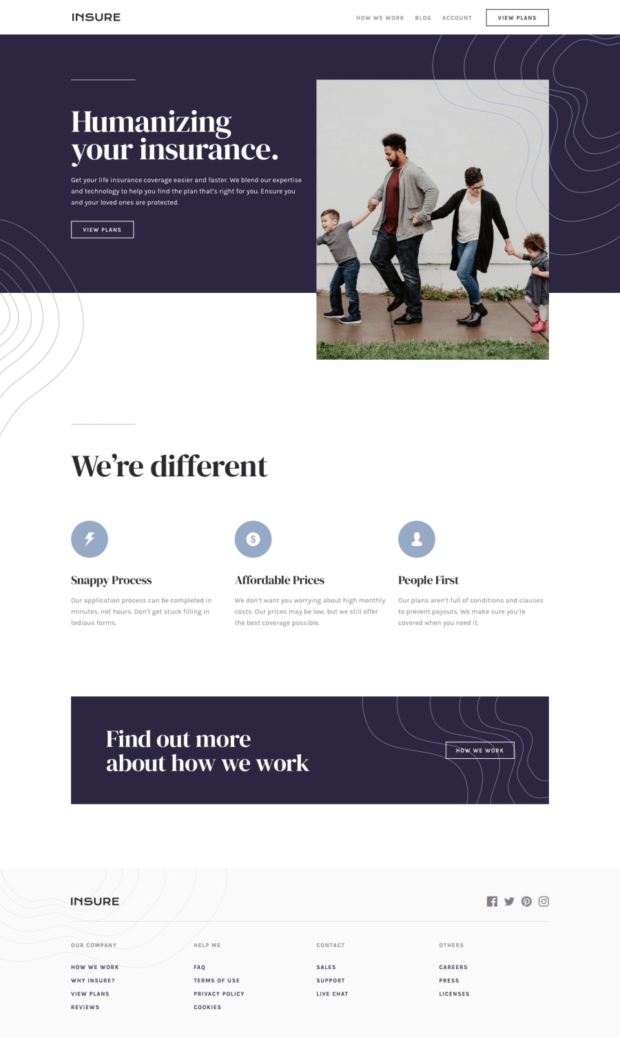
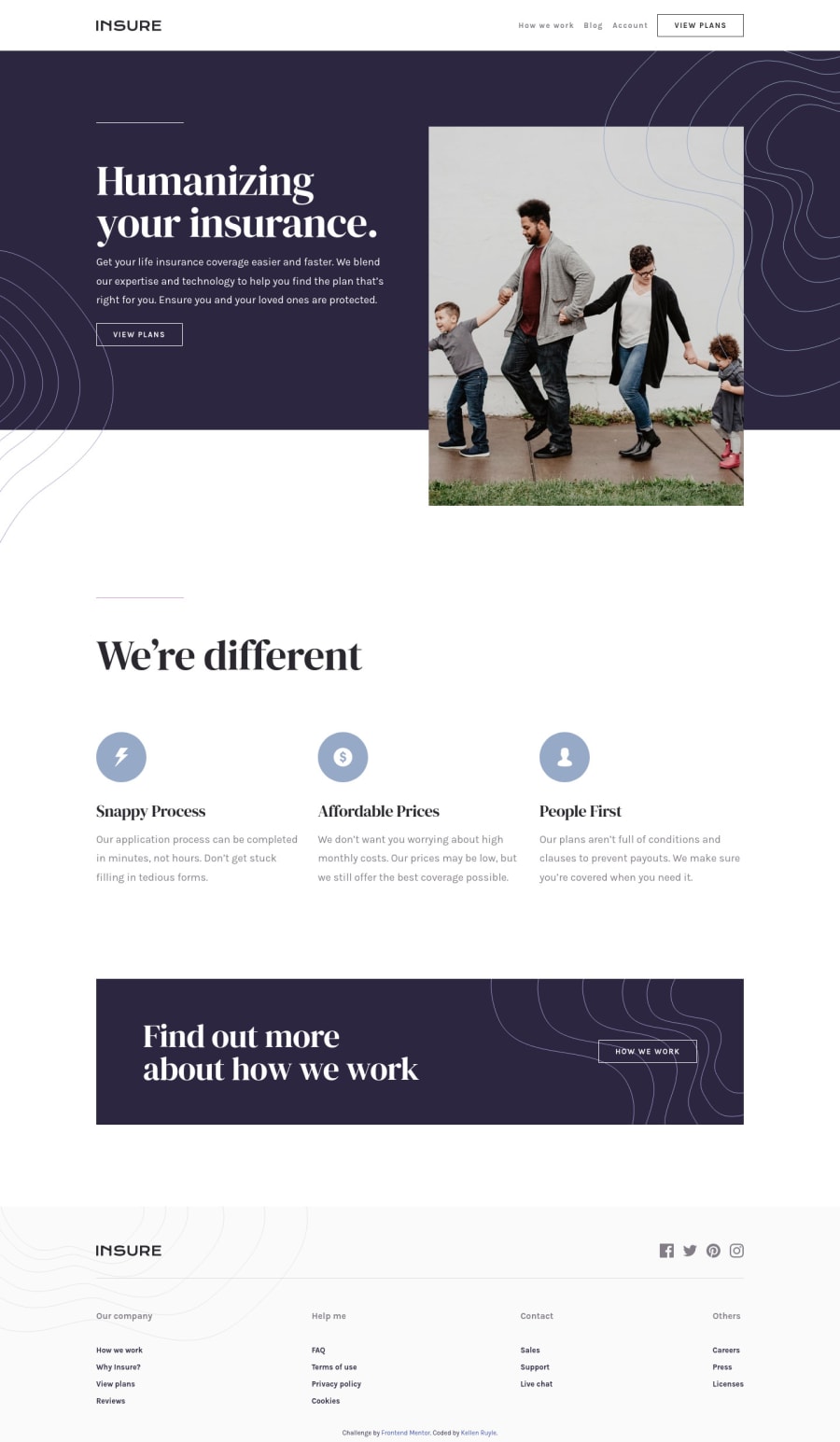
Desktop design screenshot for the Insure landing page coding challenge

This is a solution for...

  • HTML
  • CSS
  • JS
2junior
View challenge

Design comparison


SolutionDesign

Solution retrospective


Feedback and criticisms are welcomed

Community feedback

@GrzywN

Posted

Hey, well done @rule-kells!

What I can suggest you to improve is to add borders on hover state to your button, because I think you removed them from :hover and it makes your layout shift. You can add basic transitions to your elements with hover state as well. For example transition: color 0.2s ease. It would make all hover states more smooth. Don't forget to put it in the selector of element which has hover state rather than :hover itself.

Happy coding and have a nice day!

Marked as helpful

1

P

@rule-kells

Posted

Thank you @GrzywN! Thanks so much for the feedback. I'll keep this in mind for my future projects. Again, greatly appreciated!
1
Chris 240

@ChristopherParke

Posted

Looks great. My only note would be to use 3 different static sized images (mobile, tablet, desktop) rather than using relative measurements. At some screens the banner looks blurry, squished, or cut off.

Cheers!

1

P

@rule-kells

Posted

@ChristopherParke OK good to know. I sometimes struggle whether to use px or rem for pictures. Should I be using pixels for pictures?

0
Chris 240

@ChristopherParke

Posted

@rule-kells Yes. I've found the relative measurements for the pictures creates impossible to deal with sizing. It's always off at some point. I find it looks best when you just use pixels and change it at different break points using media queries.

I try to just use relative measurements for containers.

Marked as helpful

0
P

@rule-kells

Posted

Thanks, @ChristopherParke! I have wondered about that. What about %? Sorry for all the questions! Like max-width?

0
Chris 240

@ChristopherParke

Posted

@rule-kells You can use %. But it will be a % of its container. So you'd want to size the container in px or you get the same result.

1
P

@rule-kells

Posted

Thanks @ChristopherParke!

0
PhoenixDev22 16,990

@PhoenixDev22

Posted

Hello Kellen Ruyle,

Congratulation on completing another Frontend mentor challenge . You really did great work. I have some suggestions regarding your solution:

  • First of all,

Mobile navigation:

  • In class="nav__toggle--container" Use a <button> tag for the mobile navigation trigger. If you must use another HTML element , ensure that you add ARIA attribute role=buttonso the screen readers know it's clickable.(I tried the keyboard to toggle the navigation the hamburger img is not clickable . never add event listeners to non interactive elements )

  • That button needs to have an aria-expanded attribute too that states the state of the navigation whether it's open or not. If the navigation is "open " the value of the aria-expanded should be changed to true.

  • And aria-controls attribute define the relation between the button and the navigation so it is expecting its value to be the id of the navigation. That lets the user knows if the content the button controls are expanded or not.

  • Because the button has only images , put an aria-label on the button . For example , you can have : aria-label="mobile Navigation Trigger".

  • For decorative images, you should add aria-hidden="true" with alt="" as to be ignored by assistive technologies such as screen reader ignore those images.

  • When you link the user to another site using target="_blank" attribute, you can expose your site to performance and security issues. Adding "rel="noopener" or rel="noreferrer" to your "target="_blank" links avoid these issues

  • In the <footer> there is another navigation , so you can use <nav> landmark with an aria-label attribute to give the users of assistive technologies as much information as possible especially if there are multiple navigations on the site.

  • For future use , make sure to specify the button type. When a button doesn’t have a type attribute, its usage is unclear and to avoid bugs. <button type="button" class="btn">View plans</button>.

  • SEO: Document does not have a meta description. <meta name="description" content="Put your description here.">

  • Last , when you hover over the buttons the button strangely goes a little up or down due to border:none on the hover . You can fix that if the border has the same color as the background on the hover.

I hope these are helpful learning points.

1

P

@rule-kells

Posted

@PhoenixDev22 Thanks so much. Yes, I need to learn more about accessibility and definitely use best practices. Super helpful. Thanks so much. Greatly appreciated.

1

Please log in to post a comment

Log in with GitHub
Discord logo

Join our Discord community

Join thousands of Frontend Mentor community members taking the challenges, sharing resources, helping each other, and chatting about all things front-end!

Join our Discord