


@FluffyKas
Posted
Heyo,
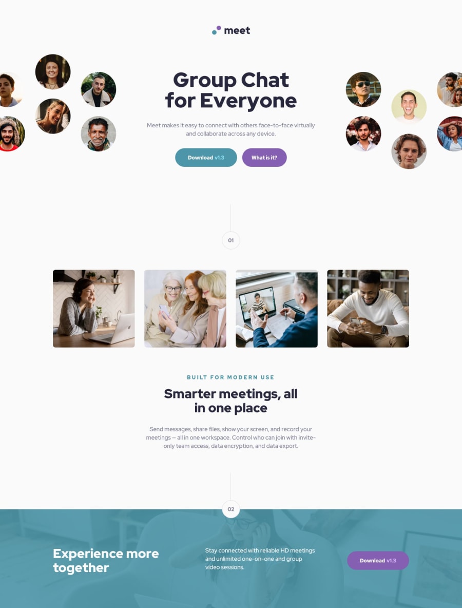
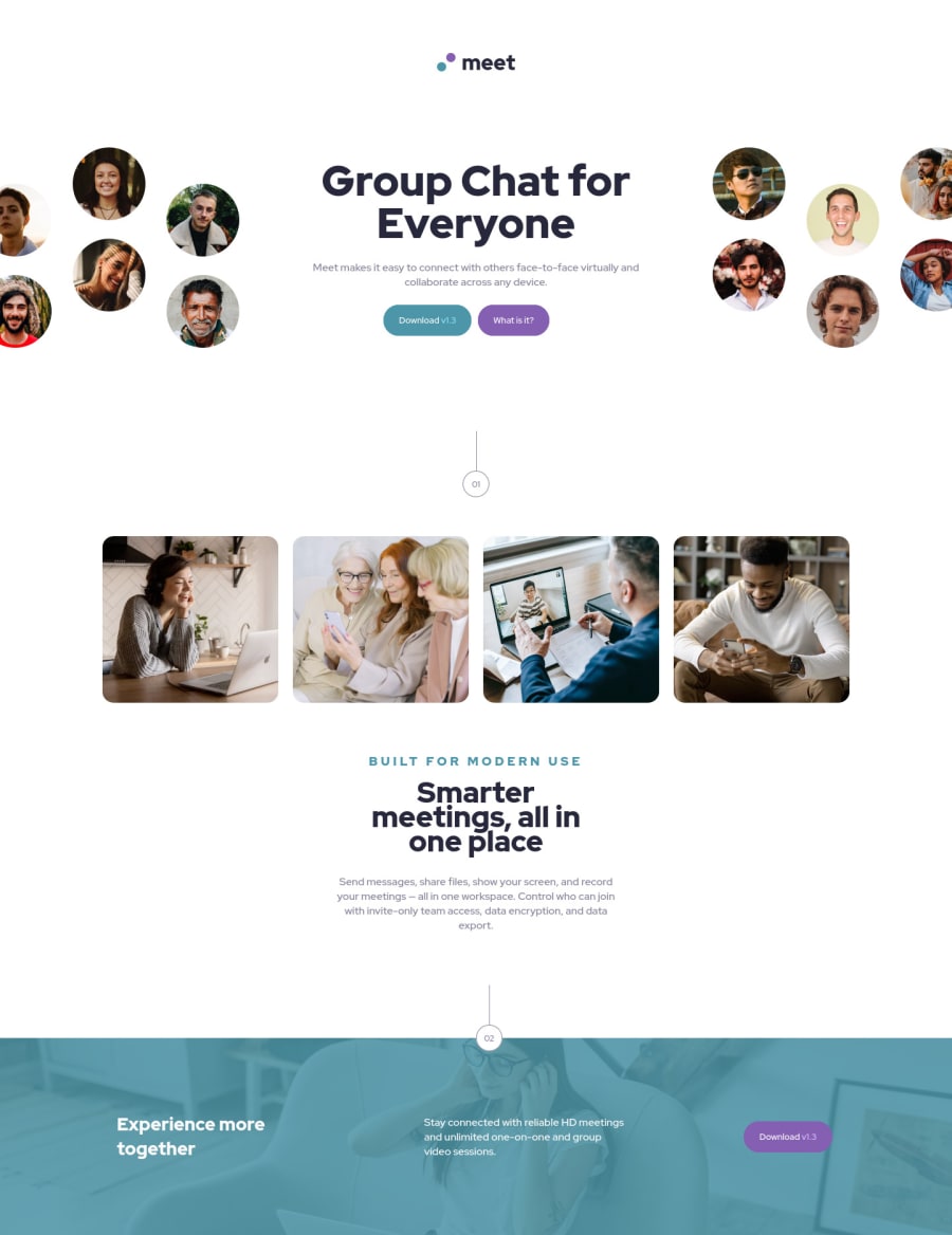
I don't see anything that would really benefit from a grid. The video-chat section could've been done with it but I see you managed just as well with flexbox! It looks like a great solution by the way, really neatly done (even the alt texts are very nice). What I would suggest to improve it a bit:
-
Everything that isn't a header or a footer in this challenge could go inside a <main> as sections in themselves aren't landmarks.
-
Check your solution between 770 and 1100 px. The header's media query could be adjusted a bit!
-
I'd put perhaps an aria-hidden="true" on some of the decorative elements that you achieved by styling divs, like the numbered buttons and lines.
Marked as helpful
@tiffanicodes
Posted
@FluffyKas thank you so much for this feedback! These notes are incredibly helpful and I'll be sure to implement them. Really appreciate you taking the time to checkout my work!

