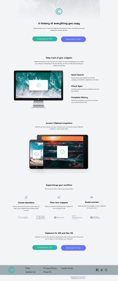
Responsive landing page using Flexbox and media queries

Solution retrospective
I'm proud of having completed the mobile-first structure smoothly and managing to adjust the layout for desktop using Flexbox. Next time, I would plan my media queries more carefully to avoid the need for patching styles later on.
What challenges did you encounter, and how did you overcome them?The biggest challenge was managing layout transitions between mobile and desktop. The mobile flow was easy to implement, but making the desktop layout work horizontally and organizing sections side by side took some tweaking. I overcame it with several adjustments using Flexbox and refining the media queries.
What specific areas of your project would you like help with?I'd appreciate feedback on how to structure my media queries more efficiently and keep the desktop layout cleaner, especially when dealing with multiple section changes.
Please log in to post a comment
Log in with GitHubCommunity feedback
No feedback yet. Be the first to give feedback on Fernando Luis Pizarro's solution.
Join our Discord community
Join thousands of Frontend Mentor community members taking the challenges, sharing resources, helping each other, and chatting about all things front-end!
Join our Discord