Responsive landing page using Grid and Flexbox

Solution retrospective
I'm very proud that I was able to apply many things I've learned from previous projects. It feels great to see how those small lessons added up and helped me complete this one more confidently.
If I were to do it again, I’d probably spend a bit more time planning the layout structure before jumping into coding. That could save time in the long run and help keep the code cleaner.
What challenges did you encounter, and how did you overcome them?One of the main challenges I faced was building the layout for the entire screen. Most of my previous challenges involved single components, so this was my first time working on a full-page layout.
To overcome this, I started by creating a rough wireframe using basic HTML and CSS. This helped me visualize the overall structure and plan how the layout should be divided. It gave me a clearer direction before diving into the actual styling and fine-tuning the details.
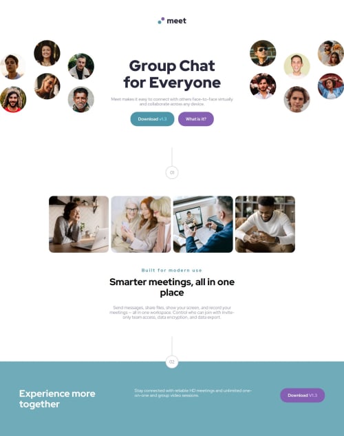
What specific areas of your project would you like help with?I tried to work around making the .hero__avatar slightly overflow out of the screen (just like in the original design), but I couldn’t quite get it right. 😭
If anyone has tips or knows how to achieve that effect properly with CSS, I’d really appreciate the help!
Thanks in advance! 🙏
Please log in to post a comment
Log in with GitHubCommunity feedback
- @lucigarpe
good job

Join our Discord community
Join thousands of Frontend Mentor community members taking the challenges, sharing resources, helping each other, and chatting about all things front-end!
Join our Discord