Submitted 4 months agoA solution to the Four card feature section challenge
Responsive landing page using HTML and CSS

@EkoNdongAyecaba
Code
Please log in to post a comment
Log in with GitHubCommunity feedback
- @chryspenalber
React has been tagged, however, it doesn't look like it has been used.
Responsive Design Considerations:
The use of grid-template-columns: repeat(auto-fill, minmax(250px, 1fr)); ensures a flexible layout that adapts well to different screen sizes. The @media screen and (min-width: 568px) breakpoint optimizes the layout for larger screens.
Consistent Naming Conventions:
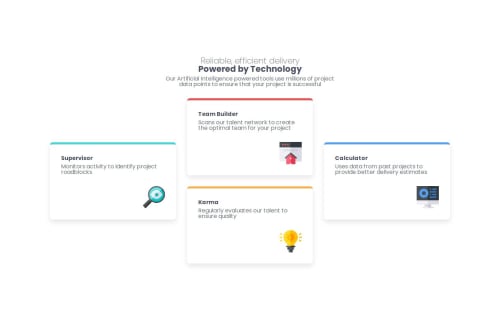
The BEM (Block-Element-Modifier) methodology is used effectively (.container__cards, .card--supervisor), making it easy to understand and modify styles.

Join our Discord community
Join thousands of Frontend Mentor community members taking the challenges, sharing resources, helping each other, and chatting about all things front-end!
Join our Discord