


Hi there,
I'd recommend you try to rework the navigation so you only have one set of nav elements. There's no need for the kind of duplication you've got at the moment, or to have two different buttons (for open/close). I also strongly recommend you use semantic elements like <nav> :)
I would
- Have position relative on the header
- Start with the mobile nav style for that list of links, position absolute, top 0, left 0, flex column, opacity 0, visibility hidden, width 0
- Have one button with
aria-controls="nav-list-id" aria-expanded="false" aria-label="Open navigation" - Add event listener on click that runs a function called something like
toggleNav - Write a function to: toggle a class on the header / nav wrapper, something like
is-open; toggle aria-expanded on the button between false and true; toggle the aria label on the button between open navigation and close navigation - In css, use a selector like
.is-open .nav-listto change the width and opacity of the nav to how it should look when open - In css have a media query that restyles your navigation to its desktop design and hides the mobile nav button
- You could also add an event listener in javascript listening for window resize. That would run a function to resetMobileNav, that returns if the window is smaller than your breakpoint where the nav changes to its desktop design, or resets all those values when the window is bigger than that breakpoint (remove is-open class, resets aria-label and aria-expanded to their closed/original state)
I hope this is a helpful tutorial! Good luck with your learning
Other suggestions as follows:
- Wrap the logo in an anchor tag, that's what it would always have in a real site
- Very very important for the logo to have alt text - how would assistive tech know what this site/product is called?
- Use css to capitalise text rather than writing it in capitals in the HTML
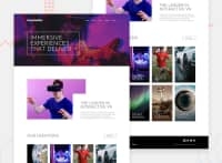
image-interactive.jpgis a meaningful image so deserves a proper alt text description- You mustn't jump heading levels. Style however you like with css, but headings after h1 need to be h2s. This is important for SEO and assistive technology, which basically create a contents page of each webpage to communicate and understand semantics
- You only need one see all button I think - I would use flex ordering in this case
- Each card in collections looks like it should be a link. If it has a hover effect, it should be interactive. I would probably have all these in an unordered list tbh. And it definitely shouldn't use heading tags for those as they have no content underneath them.
- Lastly, in the footer the logo needs alt text again, and social links all need wrapping in anchor tags.
It sounds like a lot I know, but a lot of this stuff is really small and easy to fix so definitely worth doing if you can spend another hour on this :)
@jun-edris
Posted
@grace-snow thank you for your feedback :). Would you enlighten me with those suggestions, please. Would you create a branch to the repo so that I can understand. All is messed up when I tried to implement those suggestions of yours. I'm so newbie.
@jun-edris don't worry about the menu stuff at this stage if it works for you, just focus on the second comment stuff
With the nav, I've done a similar thing on my own website so feel free to inspect that in devtools. I like to have tools open at the side not bottom as that let's you grow and shrink the screen easily while still looking at the code. There's also a link to the code rep at the bottom of homepage I think.
Hope that helps. It will make more sense in time
@jun-edris
Posted
@grace-snow thank you very much. It's an honor to be aided by an enthusiast :). Can I DM you because I am working on our thesis and I hope for some guidance along the way if you don't mind.

