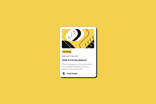
Submitted about 2 months agoA solution to the Blog preview card challenge
Responsive landing page using image

@AnthonyLPZ0
Code
Please log in to post a comment
Log in with GitHubCommunity feedback
- @GregorDeCillia
Nice work!
I noticed your font-size does not adjust based on the width of the viewport. You might be able to improve on that by using
clamplike thisbody{ font-size: clamp(0.75rem, 3.82vw, 1rem); }It makes it so the font size scales linearly with the viewport width but also sets a maximum and a minumum.
If you look closer at the mobile design, it also turns out that parts of the image are being cropped out hen screens get smaller. Yu could use
object-fitto improve on this.the "active state" from the design can be implemented with pseudo selectors (
:hoverand:active).Marked as helpful

Join our Discord community
Join thousands of Frontend Mentor community members taking the challenges, sharing resources, helping each other, and chatting about all things front-end!
Join our Discord