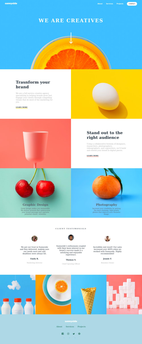
Submitted about 3 years agoA solution to the Agency landing page challenge
Responsive landing page using scss
sass/scss

@wshena
Solution retrospective
I have difficulty for hamburger menu on mobile, as you guys can see if you visit the website, i can open (click the hamburger) and then mobile links show up, but if you click it again, it won't close. If you have the solution for my problem, please teach me.
I also have difficulty with responsive wesbite
Code
Loading...
Please log in to post a comment
Log in with GitHubCommunity feedback
No feedback yet. Be the first to give feedback on Shena's solution.
Join our Discord community
Join thousands of Frontend Mentor community members taking the challenges, sharing resources, helping each other, and chatting about all things front-end!
Join our Discord