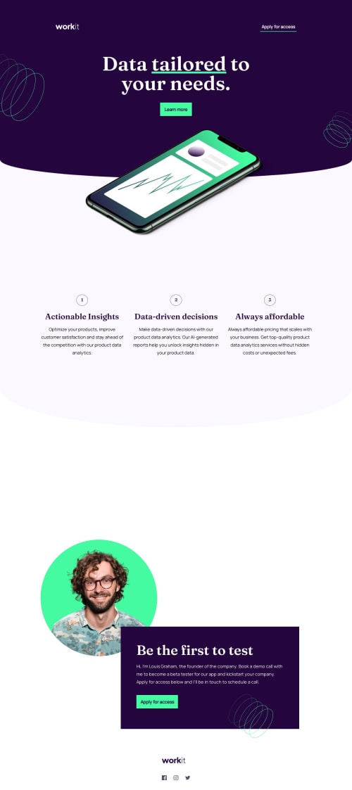
Responsive Landing Page using the basics of CSS and HTML

Solution retrospective
I had to play around a lot with the images relative positioning which made for some clunky areas. There is 1 thing that i'm not sure of:
- after the rounded bottom of the hero section there is a change in background tone. I had to set the div after the hero section to relative and push the element up in order to cover the white canvas that was left after rounding the bottom edge.
here is my HTML:
<header class="block block--primary nav--block"> <div class="nav"> <div class="icon--container"> <a href="#"><img src="assets/images/logo-light.svg" alt="Workit Logo"></a> </div> <button class="btn btn--secondary">Apply for access</button> </div> </header> <div class="block--primary block__rounded block-hero"> <div class="hero"> <div class="hero__bg-pattern-1"> <img src="assets/images/bg-pattern-1.svg" alt=""> </div> <h1 class="hero__heading">Data <u class="underline__color-accent">tailored</u> to </br>your needs.</h1> <button class="btn btn--primary hero__btn">Learn more</button> <div class="hero__bg-pattern-2"> <img src="assets/images/bg-pattern-2.svg" alt=""> </div> </div> </div> <div class="container-hero__image"> <img src="assets/images/image-hero.webp" class="hero__image" alt="Hero Image" /> </div> <section class="grid grid-feature block--secondary block__rounded"> <article class="block-feature"> <div class="feature"> <div class="feature__icon-container"> <span>1</span> </div> <h3 class="feature__heading">Actionable Insights</h3> <p class="feature__content"> Optimize your products, improve customer satisfaction and stay ahead of the competition with our product data analytics. </p> </div> </article> <article class="block-feature"> <div class="feature"> <div class="feature__icon-container"> <span>2</span> </div> <h3 class="feature__heading">Data-driven decisions</h3> <p class="feature__content"> Make data-driven decisions with our product data analytics. Our AI-generated reports help you unlock insights hidden in your product data. </p> </div> </article> <article class="block-feature"> <div class="feature"> <div class="feature__icon-container"> <span>3</span> </div> <h3 class="feature__heading">Always affordable</h3> <p class="feature__content"> Always affordable pricing that scales with your business. Get top-quality product data analytics services without hidden costs or unexpected fees. </p> </div> </article> </section>Here is my CSS: /* Hero */ .block-hero { position: relative; height: 363px; overflow: hidden; }
.hero { padding: 0 1.6rem; }
.hero__heading { margin: 0 auto; margin-bottom: 4rem; color: white; text-align: center; }
.hero__btn { display: block; margin: 0 auto; width: 13rem; height: 5.5rem; }
.container-hero__image { background-color: var(--color-secondary); height: 100px; }
.hero__image { position: relative; max-width: 320px; margin: 0 auto; left: 3.6rem; top: -10rem; overflow: visible; }
.hero__bg-pattern-1, .hero__bg-pattern-2 { position: absolute; left: -50rem; }
@media screen and (min-width: 768px) { .block-hero { height: 421px; }
.hero__image { max-width: 515px; left: 15.1rem; top: -15rem; }
.hero__bg-pattern-1 { left: -23rem; top: -6rem; }
.hero__bg-pattern-2 { bottom: 10rem; left: 68rem; } }
@media screen and (min-width: 1024px) { .block-hero { height: 405px; }
.container-hero__image { height: 320px; }
.hero__image { max-width: 770px; top: -10rem }
.hero__bg-pattern-2 { left: 90rem; } }
@media screen and (min-width: 1440px) { .block-hero { height: 510px; }
.hero__image { max-width: 770px; left: 35rem; top: -20rem }
.hero__bg-pattern-1 { left: -13rem; top: -2rem; }
.hero__bg-pattern-2 { left: 131rem; } }
@media screen and (min-width: 1880px) { .hero__image { max-width: 770px; left: 60rem; top: -20rem }
.hero__bg-pattern-2 { left: 175rem; } }
/* Features */
.grid-feature { position: relative; margin: 0; z-index: -1; top: -15rem; padding: 15rem 0; }
.block-feature { margin: 0 auto; text-align: center; }
.feature__icon-container { border-radius: 50%; border: 1px solid #584D62; font-family: 'Fraunces', Arial, Helvetica, sans-serif; width: 4.8rem; height: 4.6rem; margin: 2.4rem auto; }
.feature__icon-container>span { display: block; margin-top: 0.5rem; }
.feature__icon, .feature__heading { color: var(--color-primary); }
.feature__heading { margin: 1.6rem auto; }
.feature__content { max-width: 343px; margin: 0 auto; }
@media screen and (min-width: 768px) { .grid-feature.block--secondary { height: 1500px; align-items: start; padding: 25rem 0; }
.block-feature { text-align: left; max-height: 108px; }
.feature__icon-container { position: relative; text-align: center; margin: 0; top: 11rem; }
.feature__heading, .feature__content { max-width: 493px; margin: 1.6rem 0; margin-left: 8rem; } }
@media screen and (min-width: 1024px) { .block-feature { text-align: center; max-height: fit-content; }
.grid-feature { position: relative; grid-auto-flow: column; top: -40rem; justify-content: center; align-content: end; gap: 3rem; max-height: 1100px; }
.feature__icon-container { position: static; margin: 2.4rem auto; }
.feature__heading, .feature__content { max-width: 354px; }
.feature__heading { margin: 1.6rem auto; }
.feature__content { margin: 0 auto; } }
@media screen and (min-width: 1440px) { .grid-feature { padding: 0 10rem; } }
/* Feature Block */
.feature { margin: 4rem auto; }
Feedback Welcome! Thank you everyone.
Please log in to post a comment
Log in with GitHubCommunity feedback
No feedback yet. Be the first to give feedback on Dor Shani’s solution.
Join our Discord community
Join thousands of Frontend Mentor community members taking the challenges, sharing resources, helping each other, and chatting about all things front-end!
Join our Discord