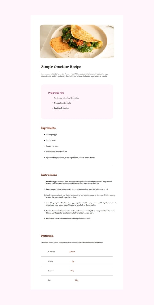
Not Found
Not Found
Not Found
Not Found
Not Found
Not Found
Not Found
Not Found
Not Found
Not Found
Not Found
Not Found
Not Found
Not Found
Not Found
Not Found
Not Found
Not Found
Not Found
Not Found

Submitted

Responsive landing page using The Box Model and Media Query.

Havillah 100

@HavillahAnya

Desktop design screenshot for the Recipe page coding challenge

This is a solution for...

  • HTML
  • CSS
1newbie
View challenge

Design comparison


SolutionDesign

Solution retrospective


What are you most proud of, and what would you do differently next time?

I am most proud of how I was able to use the right media query and percentage sizing to get the desktop layout correctly.

Next time, I will use a layout tool like grid or Flexbox to solve the challenge.

What challenges did you encounter, and how did you overcome them?

I encountered some challenges when trying to make the desktop styling.

I used media query and resized the main element and my image to match the design perfectly.

What specific areas of your project would you like help with?

I will like to know how to approach this project with Flexbox. How will my container's width and height be sized if I use Flexbox for the project?

Community feedback

P
Grace 27,890

@grace-snow

Posted

Try to get the colors and spacings much closer to the design if you can.

0

P
Grace 27,890

@grace-snow

Posted

There are some problems in the html which you should address too:

  • this design does not include a header. But if it did, this isn't what you'd use it for. It's important to understand what each landmark is for. The header is for repeating content across a site not for any page specific content. Everything in this design should be in a main.
  • I recommend you read the post in the resources channel on discord about how to write good alt text on images.
  • headings must go in order. You can't go from h1 to h3 as the next heading in the dom order.
  • remember strong is for bold emphasis not span.
  • the table must be a table with header and normal cells. The header cells should ideally have the scope attribute too.

And the CSS:

  • get into the habit of including a full modern css reset at the start of the styles in every project. Andy Bell or Josh Comeau both have good ones you can look up and use.
  • don't use percentage for margins or component width. You lose all control that way. Margins and paddings should be in rem if you want it to scale with the users font size or px if you want a fixed/static value or em in the occasional cases where you want it to scale with the current elements font size.
  • border radius in % goes strange for any elements that aren't square or circular. It's better in all other cases to use a fixed border radius.
  • adjust paddings and margins in lists or list items. You shouldn't be using position relative anywhere in this.
  • media queries must be defined in rem or em not px. this post is worth reading.
  • the component should not have a width in any unit (unless you're using a css function like clamp() or min() but that's unnecessary here). All it needs is a max width in rem.

Marked as helpful

1
perterHUAN 250

@perterHUAN

Posted

@grace-snow I also worked on this project, could you please give me some feedback when you have time?

0
Havillah 100

@HavillahAnya

Posted

@grace-snow I'll definitely take all of this into consideration and improve my code.

Thanks a lot for the feedback!

0

Please log in to post a comment

Log in with GitHub
Discord logo

Join our Discord community

Join thousands of Frontend Mentor community members taking the challenges, sharing resources, helping each other, and chatting about all things front-end!

Join our Discord