Responsive landing page with Astro

Solution retrospective
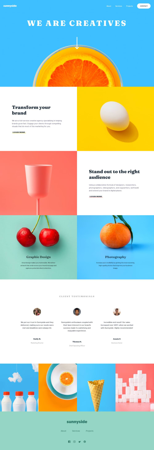
Another landing page done! This time I used CSS Grid quite a lot and I definitely feel more comfortable using it over Flexbox for most layout needs. I also used Astro so I could modularize the code and make it easier to navigate, though there was a lot of trial and error and learning easier, Astro-specific ways to do things I had already implemented, so the code is probably still messy.
The hardest part was probably the first section with the header, the heading and the arrow, mostly because of the difficulties aligning the background image properly and making it responsive. While I think the end result is decent enough, I couldn't really get it to work the way I wanted and it looks a bit awkward at certain screen sizes. I would appreciate feedback on that matter to see if there was a better approach. I thought maybe changing the background image for a normal <img> and aligning everything through the z-index might make it easier, but by this time I was almost done with the page so I didn't pursue that avenue.
Please log in to post a comment
Log in with GitHubCommunity feedback
No feedback yet. Be the first to give feedback on Antía B.'s solution.
Join our Discord community
Join thousands of Frontend Mentor community members taking the challenges, sharing resources, helping each other, and chatting about all things front-end!
Join our Discord