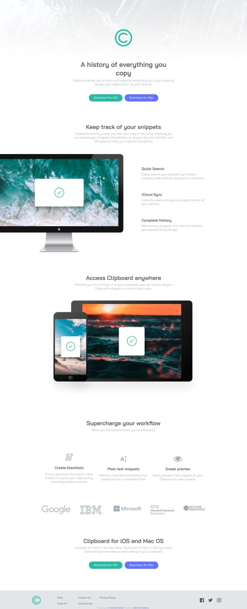
Responsive landing page with css flexbox

Solution retrospective
I am struggling to make the social media icons change color on hover, I would love some ideas on how to achieve that.
Also, the page doesn't look good on monitors wider than 1440px, do I have to write some more CSS to accommodate wider screens(1440px + screens)?
Any recommendations on what I can improve on are welcome.
Please log in to post a comment
Log in with GitHubCommunity feedback
- @FluffyKas
Hiyo,
Your social icons don't change colour on hover because they're svgs. It's a bit more complicated to style svgs than usual: you need to add them as an inline svg (=>copy-pasting the whole long svg code into your html). Then you can play around with the attribute called "fill". I'd personally say though, this challenge doesn't really call for such complicated methods, being just a junior challenge. For example, I just used Font Awesome icons instead of the svgs given. They're a lot easier to style if you're not very comfortable styling svgs yet and the result is the same or pretty similar! ^_^
As for your other question, the answer is yes, ideally you accommodate to all screen sizes. If you think about it, often screens are wider than 1440px nowadays! It's an easy fix though. What I'd do is to move the
max-width:1440pxto themainand then add amargin: 0 autoas well. Also, you could move thefooteroutside ofmain. This way you won't need to wrap all the other content in a "main-container" div either.There are some bits and bobs to adjust for large screens but I'm sure you can do it, as most of what you done looks great already! Good luck!
Marked as helpful

Join our Discord community
Join thousands of Frontend Mentor community members taking the challenges, sharing resources, helping each other, and chatting about all things front-end!
Join our Discord