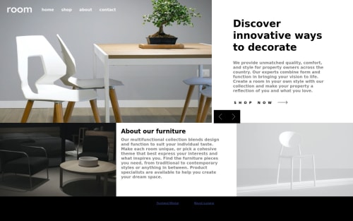
Responsive landing page with display flex and media query.

Solution retrospective
Responsive landing page with display flex and media query, switching flex-direction and width depending on image size.
Please log in to post a comment
Log in with GitHubCommunity feedback
- @Finney06
Hello there 👋. Good job on completing the challenge !
Here are some suggestions regarding your code that may be of interest to you.
HTML 🏷️:
To clear the Accessibility report:
-
Wrap the page's whole main content in the
<main>tag. -
Use HTML5 semantic elements such as
<header>,<nav>,<main>,<aside>, and<footer>to define these sections. -
Use ARIA landmarks such as
<header role="banner">and<footer role="contentinfo">to provide additional information about the purpose of each section to assistive technologies.
Here is a web accessibility evaluation tool📕 to check your webpage for any remaining errors or warnings related to landmarks.
I hope you find it helpful!😏 Above all, the solution you submitted is 👌. 🎉Happy coding!
Marked as helpful -
- @jamesekunola
There is a horizontal overflow issue in your UI, and it seems that you might have forgotten to set a maximum width for your UI. Please address these concerns, particularly when the user's screen size exceeds 90rem. Apart from these points, your user interface is fantastic.


Join our Discord community
Join thousands of Frontend Mentor community members taking the challenges, sharing resources, helping each other, and chatting about all things front-end!
Join our Discord