


Zineb Boutaa• 750
@zineb-Bou
Posted
Hi there,
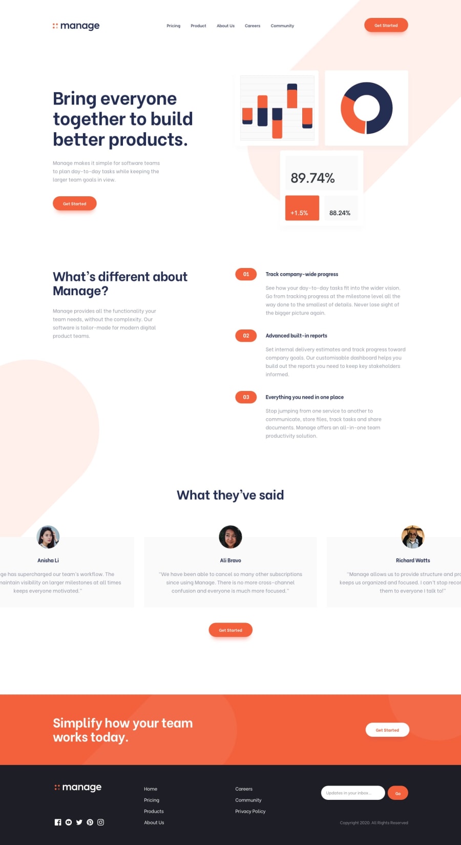
Using only @media screen and (max-width:428px) you are not covering all screen sizes, which makes the content get smashed together then scaling down to a small screen size
You shouldn't include more than h1, Apply the correct heading level
Avoid setting an explicit Height to element, this won't allow the container to shrink when content grows inside it.
When the image is just for decoration hide it from the screen readers using aria-hidden: true
I dropped some notes after I checked your code quickly.
Happy coding.
Marked as helpful
1
Waz.sheeran• 60
@ThutaZaw2603
Posted
@zineb-Bou Thanks you so much Sir!. I also found many issues after I have submitted. On the further projects, I will surely use more break points.
0
