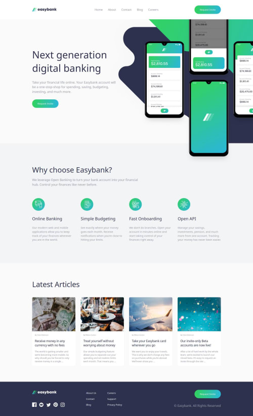
Responsive landing page with (Sub)grid, Nesting and Container queries

Solution retrospective
I used CSS Container Queries to make the app responsive and used clamp on fonts and spaces to create a fluid design, which I think worked quite well. Nesting creates a well structured CSS file.
I do wonder what the best practice is with container queries: create a query per section (header, main, footer) or one single query?
What challenges did you encounter, and how did you overcome them?I had quite some trouble aligning the mockups-image and the background in both mobile and desktop design, and I tried to implement the mobile menu without using Javascript but did not succeed.
The hamburger menu should activate the mobile menu and the layer in the main section, and toggle the hamburger icon / close icon in the header. I could not get both to work using the checked state of the checkbox input, so used JavaScript for the latter.
What specific areas of your project would you like help with?If anyone knows a CSS-only solution for the above, please let me know, but in general, all tips on how to improve are welcome.
Please log in to post a comment
Log in with GitHubCommunity feedback
No feedback yet. Be the first to give feedback on MCDoodle1's solution.
Join our Discord community
Join thousands of Frontend Mentor community members taking the challenges, sharing resources, helping each other, and chatting about all things front-end!
Join our Discord