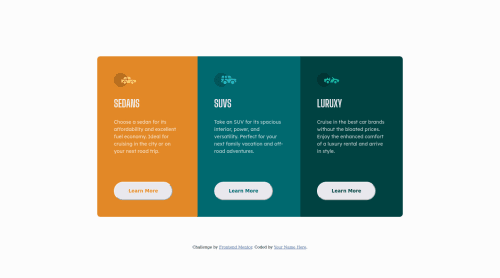
Responsive layout, Grid, Media query

Solution retrospective
All suggestions are welcome!
Please log in to post a comment
Log in with GitHubCommunity feedback
- @PhoenixDev22
Hi Cassia Moraes,
Congratulation on completing anther frontend mentor challenge. I have some suggestions regarding your solution:
- You should use
<footer>landmark for the attribution , it should live outside the the <main> as landmarks allow screen reader users to navigate through sections of your website by skipping to content that interests them. Landmarks could be seen as the logical layout of the website's UI, which is divided into e.g. header, navigation, main content, and footer. So the usage makes sense in any case.
- Page should contain
<h1>. The<h1>is most commonly used to mark up a web page title. This challenge is supposed to be one component in a web page. To tackle the accessibility issue in the report , you may use an<h1>visually hidden withclass=”sr-only”.You can find it here.
- In this challenge, the images are much likely to be decorative. For any decorative images, each img tag should have
aria-hidden="true"attribute to make all web assistive technologies such as screen reader ignore those images .
- In this challenge, what would happen when the user click those learn more? In my opinion, clicking those "learn more" would likely trigger navigation not do an action so button elements would not be right. So you should use the
<a. For future use , it's a good habit of specifying the type of the button to avoid any unpredictable bugs.
- It's not recommended to capitalize in html, let css text transform take care of that. Remember screen readers won't be able to Read capitalized text as they will often read them letter by letter thinking they are acronyms.
- Adding
rel="noopener"orrel="noreferrer"totarget="_blank"links. When you link to a page on another site usingtarget=”_blank”attribute, you can expose your site to performance and security issues.
- Add
border-radiusandoverflow hiddento the main container that wraps the three cards so you don't have to setborder-radiusto individual corners.
- width: 375px;an explicit width is not a good way to have responsive layout . Consider using max-width to the card in rem.
- Don’t Repeat Your CSS(DRY) is a good general principle to follow and eliminating duplication of css code should naturally be part of coding journey.
- Consider using rem for font size , it' not recommended to use px for font size as absolute units don’t scale for example 15px will always be 15px on the same device. Using pixels is a particularly bad practice for font sizing because it can create some accessibility problems for users with vision impairments.
- Remember a modern css reset on every project that make all browsers display elements the same.
Aside these, your solution looks great. Hopefully this feedback helps.
Marked as helpful - You should use
- @AdrianoEscarabote
Oi Cássia, tudo bem?
Só para não perder o hábito vou tentar dar algumas dicas úteis para melhorar seu código!! hahahaha
Para que o usuário saiba que um elemento é clicável, não esqueça de adicionar o atributo
cursorcom o valorpointer:button { cursor: pointer; }- Considere usar rem para o tamanho da fonte. Se os tamanhos de fonte do conteúdo da web forem definidos para unidades absolutas, como pixels, o usuário não poderá redimensionar o texto ou controlar o tamanho da fonte com base em suas necessidades. Unidades relativas “esticam-se” de acordo com o tamanho da tela e/ou tamanho de fonte preferido do usuário e funcionam em uma grande variedade de dispositivos.
se você quiser continuar codificando com px, você pode baixar uma extensão muito útil no vscode, ela converte px em rem! link -> px para rem
o resto é ótimo!
espero ter ajudado... 👍
Marked as helpful


Join our Discord community
Join thousands of Frontend Mentor community members taking the challenges, sharing resources, helping each other, and chatting about all things front-end!
Join our Discord