Responsive layout, Grid, Media query

Solution retrospective
Accepted as all suggestions, mainly with the use of fonts. I'm looking to evolve.
Please log in to post a comment
Log in with GitHubCommunity feedback
- Account deleted
Hey there! 👋 Here are some suggestions to help improve your code:
-
To better identify the main content of you site you will want to encase your entire component inside a Main Element.
-
To center you content to your page, add the following to your Body Element:
body { min-height: 100vh; display: grid; place-content: center; }-
The Alt Tag Description for the image needs to be improved upon. You want to describe what the image is; they need to be readable. Assume you’re describing the image to someone.
-
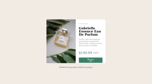
The name of the perfume , “Gabrielle Essence Eau De Parfum” is the most important content in your card so it should be wrapped in a Heading Element.
If you have any questions or need further clarification, let me know.
Happy Coding! 👻🎃
Marked as helpful -
- @AdrianoEscarabote
Oi Cassia, tudo bem?
Gostei bastante do resultado do seu projeto, mas tenho algumas dicas que acho que você vai gostar:
- Prefira usar
remdo quepxpara ter uma pagina trabalhando melhor entre navegadores, e redimensionar os elementos devidamente. - todo documento html, deve conter uma tag main, para podermos identificar qual o conteudo principal, para arrumar isso envolva todo o conteudo com a tag
main. - Para alinhar algum conteudo no centro da tela, prefira usar o
flex-box, por exemplo:
body {
    margin: 0;
    padding: 0;
    display: flex;
    align-items: center;
    justify-content: center;
    min-height: 100vh;
}
O conteudo ficará alinhado!
o resto esta otimo!
espero que ajude... 👍
Marked as helpful - Prefira usar

Join our Discord community
Join thousands of Frontend Mentor community members taking the challenges, sharing resources, helping each other, and chatting about all things front-end!
Join our Discord