


@zineb-Bou
Posted
Hi there, some notes may be helpful
-
I recommend using the <h2> inside the card rather than the <h1>, in real production this card would be a component part of the whole website, and the website should contain only one <h1>
-
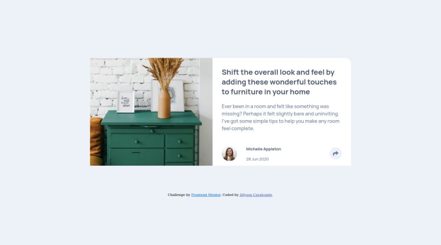
You can simply use the <img > tag for the card image no need to use <figure/> either if you want to use some caption to it, at this time it's useful, <figure /> is one of the HTML 5 features before if you want to add a caption to image, illustration or diagram you have to add <p> tag or <sapn>
-
You have to pay attention to the heading level, using <h2> for just a simple share tag and a <h3> for the username, it is not very helpful when it comes to accessibility, I recommend using just <p>, it's fairly enough.
-
For the arrow share button, it is actually an icon button, you have to use the <button> with aria-label="share it", and hide the share icon since it's only for decoration. the same thing is applied to social media links they are not images, they are links that should contain hidden text that is read using a screen reader and it leads the user to another page when it gets clicked on.
-
I notice that you are using a reset.css file, I recommend checking this article, it's the modern CSS rest, I really love it.
-
I always make sure to mention this, use rem (or em ) instead of px, it's an absolute unit, using rem will make everything scale when the user chooses the base size.
-
Instead of putting
height:100vh, usemin-height: 100vh,why? because the layout won't scale to fit the total screen height when changing to small devices. -
Also avoid setting the
overflow: hidden, for large containers, if there is any content overflow this won't fix the issue, it's a temporary solution just to beautify your design, and imagine if the content will grow inside the card it will be cut off. -
I noticed repeating the overflow property two times inside the
container, CSS always takes the last one been set, make sure to not repeat the same property two times.
Happy coding
Marked as helpful

@kenreibman
Posted
@zineb-Bou Great feedback! I was just looking to comment the same thing. I hope he takes your advice and uses it for future projects :)
Marked as helpful
@allysonbelo
Posted
@lmaoken Tank you.
@allysonbelo
Posted
@zineb-Bou
Thanks for the constructive and positive reviews.
My English is not that good, so I am using the translator, but I believe I have solved some things that guided me.
I don't have someone to guide me and I'm glad I did. What I know is what I learn in video classes or short courses.
This particular challenge was a bit tricky for me even though it seems pretty simple as I put into practice what I just learned from Sass and am learning in Js.
Thank you for paying attention to my code.
