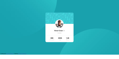
Submitted almost 5 years agoA solution to the Profile card component challenge
Responsive layout - a flex approach

@Will-1-Am
Solution retrospective
After a lot of trial and error, a reasonably presentable solution is ready for your friendly suggestions and criticisms. I used the before and after pseudo elements and layering to get the background images to remain in their desired positions while achieving a responsive design for all viewport sizes. Flex-box is a great tool as is the before and after pseudo-elements when coupled with absolute & relative positioning. Please provide feedback on this HTML/CSS coding - it will be greatly appreciated.
Code
Loading...
Please log in to post a comment
Log in with GitHubCommunity feedback
No feedback yet. Be the first to give feedback on William Spanfelner's solution.
Join our Discord community
Join thousands of Frontend Mentor community members taking the challenges, sharing resources, helping each other, and chatting about all things front-end!
Join our Discord