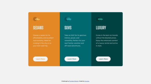
Responsive layout to the 3 grid card challenge

Solution retrospective
Hi Frontend Mentor Community!👋
This is my take on the 3 grid cards challenge. I tried a desktop first approach, even though I was curious to make a mobile first website. I think It turned out pretty ok and any suggestions or help is welcome! 😄
The main thing that I was worried about was the utilization of SASS on a part of the code where I used nesting to make the hover effect, when compiling to CSS the :hover come with a space between the class name of the component, that made me fix manually the CSS code afterwards. 😵
Please log in to post a comment
Log in with GitHubCommunity feedback
No feedback yet. Be the first to give feedback on Alexandre Covolan’s solution.
Join our Discord community
Join thousands of Frontend Mentor community members taking the challenges, sharing resources, helping each other, and chatting about all things front-end!
Join our Discord