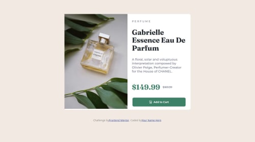
Submitted over 1 year agoA solution to the Product preview card component challenge
Responsive layout using % and text-transform

@AliceeLe
Solution retrospective
What are you most proud of, and what would you do differently next time?
I get to learn text-transform and get more confident in organizing elements into flex boxes.
What challenges did you encounter, and how did you overcome them?I have to eye measure a lot the number for vw for text-transform. I attained my design mainly through trial and error.
What specific areas of your project would you like help with?Not much right now, and I look forward to learning Tailwind CSS soon.
Code
Loading...
Please log in to post a comment
Log in with GitHubCommunity feedback
No feedback yet. Be the first to give feedback on Alice's solution.
Join our Discord community
Join thousands of Frontend Mentor community members taking the challenges, sharing resources, helping each other, and chatting about all things front-end!
Join our Discord