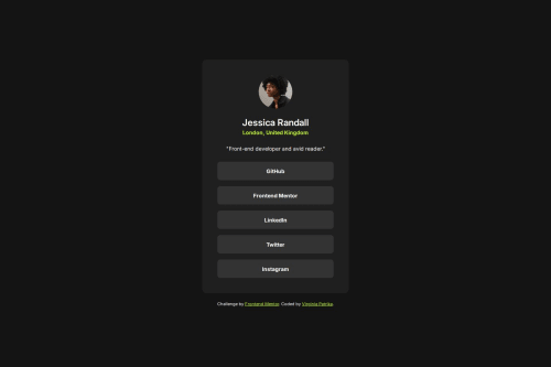
Submitted 6 months agoA solution to the Social links profile challenge
Responsive layout using CSS flexbox

P
@VirginiaPat
Solution retrospective
What are you most proud of, and what would you do differently next time?
I am proud that I completed the challenge.
What specific areas of your project would you like help with?I included in my files a css-reset.css file in which I added all the css resets from Andy Bell (https://piccalil.li/blog/a-more-modern-css-reset/), even though not all of them are necessary. Do you think it is a good practice to do that in every project? Any feedback is helpful!
Code
Please log in to post a comment
Log in with GitHubCommunity feedback
- P@kaamiik
Read the CSS reset and learn them all and put the ones that really needed. Some notes:
- Inside your HTML, there are some parts that you can easily remove or there is no point in using it. For example: You can use a
divinstead ofarticle. You can removefigureand use the image directly without any wrapper. You can remove.bio-container. You can remove.container-socials. All of them are not necessary and some of them are pointless. Make your code as simple as you can.
- Your
.card-containerdoes not need amin-widthand actually you do not need any media query for this challenge except maybe for font size. First of all you have to removealign-items: center;from yourbodythen add amax-widthinremto your.card-containerand center it withmargin-inline. With this there is no need for media query or min-width.
Your code is good and just need some refactoring.
Marked as helpful - Inside your HTML, there are some parts that you can easily remove or there is no point in using it. For example: You can use a


Join our Discord community
Join thousands of Frontend Mentor community members taking the challenges, sharing resources, helping each other, and chatting about all things front-end!
Join our Discord