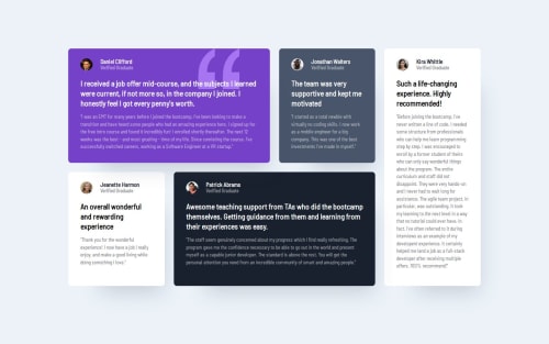
Submitted over 1 year agoA solution to the Testimonials grid section challenge
Responsive layout using CSS Grid and Media Queries

@MajdMohammed
Solution retrospective
What are you most proud of, and what would you do differently next time?
I am proud I could manage to use the CSS grid.
What challenges did you encounter, and how did you overcome them?I encountered challenge with the scaling of the body padding, I used clamp to solve the problem.
What specific areas of your project would you like help with?When to use certain untis like em. How can I calculate the dimensions in the design so I can clone it better.
Code
Loading...
Please log in to post a comment
Log in with GitHubCommunity feedback
No feedback yet. Be the first to give feedback on Mohammed Majd's solution.
Join our Discord community
Join thousands of Frontend Mentor community members taking the challenges, sharing resources, helping each other, and chatting about all things front-end!
Join our Discord