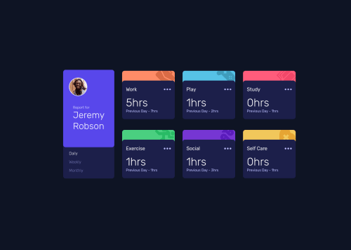
Skip to content
  • Unlock Pro
  • Log in with GitHub
Solution
Submitted over 2 years ago

Responsive Layout using CSS Grid (And some flex box)

MosElsh•200
@mosElsh
A solution to the Time tracking dashboard challenge
View live sitePreview (opens in new tab)View codeCode (opens in new tab)
Code
Select a file

Please log in to post a comment

Log in with GitHub

Community feedback

  • romila•3,550
    @romila2003
    Posted over 2 years ago

    Hi Em-ee24,

    Congratulations 🎉 for completing this challenge, your Time tracking dashboard component looks great, and it is great that you used CSS Grid to arrange the cards. I have some suggestions I want to address:

    1. Even though, it is great that you wrapped the main content within the main tag, you should also wrap the footer within the footer tag e.g. <footer class="attribution"></footer>
    2. Your images are missing the alt attribute which is essential for all images
    3. I noticed that all of your CSS and JavaScript is within your HTML file. I would recommend you using separate files as it will be easier for organisation.
    4. In desktop mode, you can use the flex property to center the card e.g.
    body {
      display: flex;
      align-items: center;
      justify-content: center;
      min-height: 100vh;
      flex-direction: column;
    }
    

    Overall, great work and wish you the best for your future projects so keep coding 👍.

    Marked as helpful

Join our Discord community

Join thousands of Frontend Mentor community members taking the challenges, sharing resources, helping each other, and chatting about all things front-end!

Join our Discord
Frontend Mentor logo

Stay up to datewith new challenges, featured solutions, selected articles, and our latest news

Frontend Mentor

  • Unlock Pro
  • Contact us
  • FAQs
  • Become a partner

Explore

  • Learning paths
  • Challenges
  • Solutions
  • Articles

Community

  • Discord
  • Guidelines

For companies

  • Hire developers
  • Train developers
© Frontend Mentor 2019 - 2025
  • Terms
  • Cookie Policy
  • Privacy Policy
  • License

Oops! 😬

You need to be logged in before you can do that.

Log in with GitHub

Oops! 😬

You need to be logged in before you can do that.

Log in with GitHub

How does the accessibility report work?

When a solution is submitted, we use axe-core to run an automated audit of your code.

This picks out common accessibility issues like not using semantic HTML and not having proper heading hierarchies, among others.

This automated audit is fairly surface level, so we encourage to you review the project and code in more detail with accessibility best practices in mind.

How does the CSS report work?

When a solution is submitted, we use stylelint to run an automated check on the CSS code.

We've added some of our own linting rules based on recommended best practices. These rules are prefixed with frontend-mentor/ which you'll see at the top of each issue in the report.

The report will audit 1st-party linked stylesheets, and styles within <style> tags.

How does the HTML validation report work?

When a solution is submitted, we use html-validate to run an automated check on the HTML code.

The report picks out common HTML issues such as not using headings within section elements and incorrect nesting of elements, among others.

Note that the report can pick up “invalid” attributes, which some frameworks automatically add to the HTML. These attributes are crucial for how the frameworks function, although they’re technically not valid HTML. As such, some projects can show up with many HTML validation errors, which are benign and are a necessary part of the framework.

Oops! 😬

You need to be logged in before you can do that.

Log in with GitHub