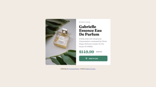
Responsive Layout using Flex Product Preview Card Component

Solution retrospective
The original plan I sorted out to tackle this challenge only needed a few tweaks here and there to work the way I expected it to, this I am most proud of. This was fairly easy to achieve with merely flex, however, next time I plan on taking this on by using grid instead and see what I can do with that.
What challenges did you encounter, and how did you overcome them?The challenge I encountered was making it responsive while still resembling the original design as closely as possible. For some reason adding padding to the second section of my layout made the image behave and remain its height.
What specific areas of your project would you like help with?Any pointers on how to achieve this without many media queries or any at all?
Please log in to post a comment
Log in with GitHubCommunity feedback
- @Yashi-For-Now
This is so awesome. Exactly the same.

Join our Discord community
Join thousands of Frontend Mentor community members taking the challenges, sharing resources, helping each other, and chatting about all things front-end!
Join our Discord