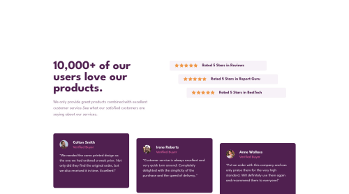
Submitted almost 3 years agoA solution to the Social proof section challenge
Responsive layout using HTML / CSS.
accessibility, bem, contentful, lighthouse

@Petru14
Solution retrospective
I have only one problem with this challenge, it's the mobile navigation, the value set for height isn't the best practice but I tried a few solutions but unsuccessfully. Any feedback it's more than welcome.
Code
Loading...
Please log in to post a comment
Log in with GitHubCommunity feedback
No feedback yet. Be the first to give feedback on Petru Banceanu's solution.
Join our Discord community
Join thousands of Frontend Mentor community members taking the challenges, sharing resources, helping each other, and chatting about all things front-end!
Join our Discord