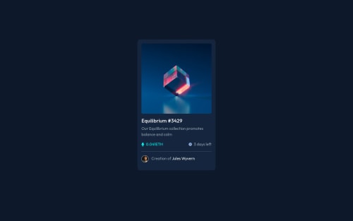
Responsive layout with bootstrap card and layout , Css and Html

Please log in to post a comment
Log in with GitHubCommunity feedback
- @denielden
Hi Kester, congratulations on completing the challenge, great job! 😁
Some little tips for optimizing your code:
- add
maintag and wrap the card for improve the Accessibility - also you can use
articletag instead of a simpledivto the container card for improve the Accessibility - remove all
marginfromcardclass - use flexbox to the body to center the card. Read here -> best flex guide
- after, add
min-height: 100vhto body because Flexbox aligns child items to the size of the parent container - instead of using
px or %use relative units of measurement likerem-> read here
Hope this help! Happy coding 😉
- add
- @correlucas
👾Hi Kester Munetsi, congrats on completing this challenge!
Your solution its almost done and I’ve some tips to help you to improve it:
Your component is perfect, but is not responsive yet, this is due the
fixed widthyou've applied to the container.Look both
widthandmax-widththe main difference between these properties is that the first(width) is fixed and the second(max-width) isflexible, for example, a component withwidth: 320pxwill not grow or shrink because the size will be ever the same, but a container withmax-width: 320pxormin-width: 320pxcan grow or contract depending of the property you've set for the container. So if you want a responsive block element, never usewidthchoose ormin-widthormax-width.✌️ I hope this helps you and happy coding!


Join our Discord community
Join thousands of Frontend Mentor community members taking the challenges, sharing resources, helping each other, and chatting about all things front-end!
Join our Discord