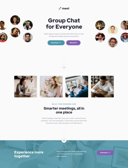
Responsive meet landing page made with flexbox and grid

Solution retrospective
I had problems with getting the hero image to be cropped symmetrically when the viewport got too narrow to fit it. The solution, though, turned out to be fairly simple:
- give image
max-width: none - horizontally center the image within its container
- horizontally center the container itself on the page
- apply
overflow: hiddento the container
.header {
    display: flex;
    flex-direction: column;
    align-items: center; // centers the image horizontally
    // align instead of justify because we set flex direction to column

    width: 100%; // image container (header) is as wide as the page so it's already centered
    overflow: hidden; // this must be present

    &__hero-image-tablet {
        height: 160px;
        max-width: none; // we cannot restrict the image width
    }
In the desktop layout, where the hero image is split into two, I used grid with justify-content: center (centered the whole grid within the page) and grid-template-columns: 1fr rem(448px) 1fr. That ensured the heading (middle column) always gets enough space, while the hero images get rest of the page width. If that's not enough to fit them, they both get cropped symmetrically, which is the desired behaviour.
.header {
        display: grid;
        grid-template-columns: 1fr rem(448px) 1fr; // gives images only leftover space
        justify-items: center; // centers items within their cells

        justify-content: center; // centers the whole grid within the header
        // must be here to crop the images symmetrically

        overflow: hidden; // must be included also

        &__hero-image-left, &__hero-image-right {
            max-width: none; // again, we cannot restrict width of the images
            grid-row: 2;
        }

        // Other grid items here
    }
Despite trying different text-wrap options, I couldn't get some texts to wrap as they do in the design.
For example in the desktop layout, the heading "Smarter meetings, all in one place" should wrap after "all" on 1440p screen width but in my solution it wraps after "in" or after "meetings" in Firefox.
If you know any tricks for getting the text to wrap as you want it to, I'd really appreciate if you shared them.
Any feedback regarding other aspects of the solution is welcome too, of course!
Please log in to post a comment
Log in with GitHubCommunity feedback
No feedback yet. Be the first to give feedback on Alexander3717's solution.
Join our Discord community
Join thousands of Frontend Mentor community members taking the challenges, sharing resources, helping each other, and chatting about all things front-end!
Join our Discord