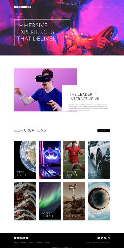
Responsive (mobile and Desktop), using FlexBox and Grid.

Solution retrospective
For this project, I decided to try 'display=grid' in conjunction with 'display=flex'. I could've used 'display=grid' in the 'section=creations' instead of creating a new button for the mobile version, but it only occurred to me after the fact 😅, so I decided to leave it as it is but to use it on the footer section. Feel free to leave your feedback, I'm giving my first steps here 😁, and any help will be much appreciated. Happy coding everyone.
Please log in to post a comment
Log in with GitHubCommunity feedback
No feedback yet. Be the first to give feedback on Bruno's solution.
Join our Discord community
Join thousands of Frontend Mentor community members taking the challenges, sharing resources, helping each other, and chatting about all things front-end!
Join our Discord