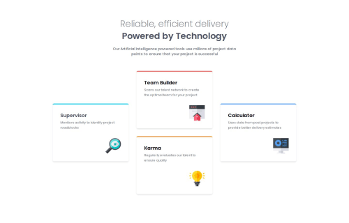
Responsive Mobile-First content-grid

Solution retrospective
I'm proud about making adaptive grid, using Tailwind However, next time, I wouldn't create a hard-coded 3x3 grid, but rather prefer create it on the go, using col-start and row-start
What challenges did you encounter, and how did you overcome them?I was struggling a lot with the TailWindCSS, after I've turned it off for the night, since I didn't add a proper watch to the input.css file. and it was working very weirdly npx tailwindcss -i ./src/input.css -o ./src/output.css --watch
Please log in to post a comment
Log in with GitHubCommunity feedback
- @xianort
Hello Mushrooms. You hardcoded almost everything. Why not customize your Tailwind theme? Would have saved you some, if not a lot of that hardcoding.
I don't know if you'd like some advice, but I'm gonna give you some anyway.
Hope you find this useful.
Marked as helpful
Join our Discord community
Join thousands of Frontend Mentor community members taking the challenges, sharing resources, helping each other, and chatting about all things front-end!
Join our Discord