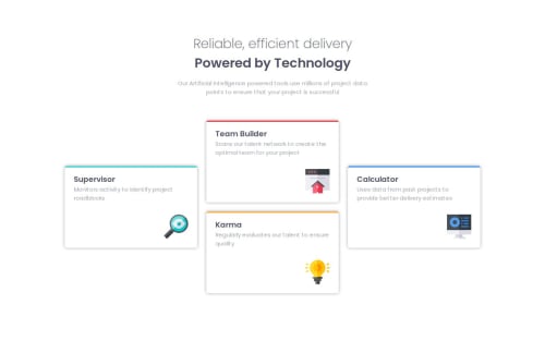
Submitted about 1 year agoA solution to the Four card feature section challenge
Responsive mobile-first design using flexbox and grid

@PrestonLTaylor
Solution retrospective
What are you most proud of, and what would you do differently next time?
As they are reusable components for the cards using a framework like astro or react could be used to define these cards as components.
What challenges did you encounter, and how did you overcome them?I had a problem implementing the card cantering using flexbox only, so I switched to using a grid layout for the main desktop design and learnt how grid-template works.
What specific areas of your project would you like help with?Any feedback on the implementation of my CSS styles.
Code
Please log in to post a comment
Log in with GitHubCommunity feedback
- @Sheikh-Mussadiq
Great job with CSS grid! Now you can explore more complex layouts.

Join our Discord community
Join thousands of Frontend Mentor community members taking the challenges, sharing resources, helping each other, and chatting about all things front-end!
Join our Discord