Responsive Mobile-First Design using Tailwind CSS

Solution retrospective
What I’m Most Proud Of: I'm proud that I completed this challenge by writing all the HTML, CSS (Tailwind), and JavaScript logic on my own — without following any tutorials. I focused on building everything from scratch, especially the date logic for the age calculation, which pushed my problem-solving and JS fundamentals. Seeing the UI match the design and the logic work correctly was a big confidence boost. What I’d Do Differently Next Time: Next time, I’d plan out the structure of my JavaScript functions earlier and validate user input more thoroughly from the start. I also realized the value of accessibility and better form UX, so I’d spend more time improving that aspect too. Additionally, I’d like to write more reusable components and keep my code cleaner as the project grows.
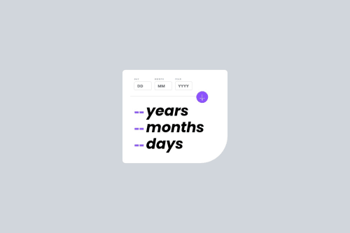
What challenges did you encounter, and how did you overcome them?Challenges I Faced: One of the main challenges was implementing accurate age calculation logic in JavaScript. Handling edge cases like leap years, months with different day lengths, and adjusting for negative values in date subtraction was tricky. Another challenge was aligning the UI perfectly with the design, especially positioning elements using Tailwind CSS and making sure it worked responsively.
How I Overcame Them: For the age logic, I broke down the problem into smaller steps, tested each case, and researched how JavaScript handles date calculations (like using new Date(year, month, 0) to get the last day of a month). I also validated input carefully and used debugging techniques to ensure the logic worked. For styling, I inspected the Frontend Mentor reference image closely, tweaked Tailwind classes through trial and error, and refined spacing until it matched the challenge specs.
What specific areas of your project would you like help with?Areas I’d Love Feedback On: JavaScript logic: Are there more efficient or cleaner ways to structure the age calculation? Any edge cases I may have missed?
Tailwind CSS usage: Is my class structure readable and maintainable? Could I have handled layout or spacing better?
Accessibility: Are there improvements I can make to form accessibility, like better labels, focus states, or ARIA roles?
Responsiveness: Does the layout hold up well across devices? Any UI improvements for small screens?
Please log in to post a comment
Log in with GitHubCommunity feedback
No feedback yet. Be the first to give feedback on Muhammad Adnan's solution.
Join our Discord community
Join thousands of Frontend Mentor community members taking the challenges, sharing resources, helping each other, and chatting about all things front-end!
Join our Discord