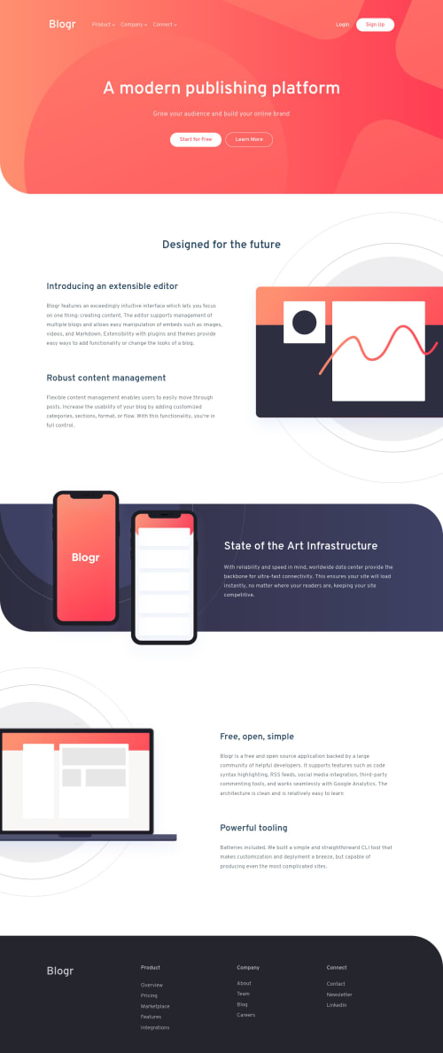
Skip to content
  • Learning paths
  • Challenges
  • Solutions
  • Articles
  • Unlock Pro
  • Log in with GitHub
Solution
Submitted over 3 years ago

Responsive mobile first landing page Vue.js

Andy•295
@AndreanaPerla
A solution to the Blogr landing page challenge
View live sitePreview (opens in new tab)View codeCode (opens in new tab)

Solution retrospective


Since I recently started studying it, I wanted to test myself (LOL) by building the landing page with Vue.js. The result can certainly be better, especially in defining the methods. Any advice is welcome :)

Code
Select a file

Please log in to post a comment

Log in with GitHub

Community feedback

  • Account deletedPosted over 3 years ago

    Hi,

    On the navigation bar I think it would be best when one menu opens the other should close, and the arrow should change where it is pointed based on whether it's active or not.

    And the responsive, I'm not sure how I feel about it because it's like everything is getting smaller and smaller as you down-size.

Join our Discord community

Join thousands of Frontend Mentor community members taking the challenges, sharing resources, helping each other, and chatting about all things front-end!

Join our Discord
Frontend Mentor logo

Stay up to datewith new challenges, featured solutions, selected articles, and our latest news

Frontend Mentor

  • Unlock Pro
  • Contact us
  • FAQs
  • Become a partner

Explore

  • Learning paths
  • Challenges
  • Solutions
  • Articles

Community

  • Discord
  • Guidelines

For companies

  • Hire developers
  • Train developers
© Frontend Mentor 2019 - 2025
  • Terms
  • Cookie Policy
  • Privacy Policy
  • License

Oops! 😬

You need to be logged in before you can do that.

Log in with GitHub

Oops! 😬

You need to be logged in before you can do that.

Log in with GitHub

Oops! 😬

You need to be logged in before you can do that.

Log in with GitHub