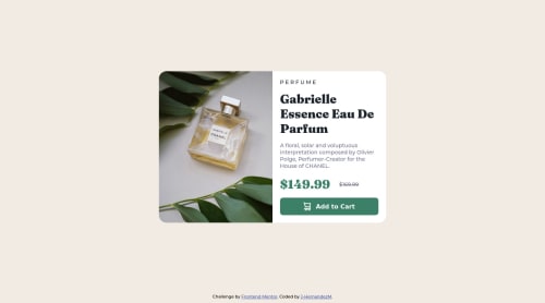
Submitted over 2 years agoA solution to the Product preview card component challenge
Responsive Mobile First product card preview using HTML and CSS

@J-HernandezM
Solution retrospective
is there a way to do it better? im starting to learn HTML and CSS basics so i dont know REACT yet im in the basis of JS so far
Code
Please log in to post a comment
Log in with GitHubCommunity feedback
- @fibonacci001
you really did a good job on the desktop display, but you should have grouped both the image and card content in a div and used display: flex; flex-direction: row; and in the media query, you change the direction flex-direction: column; hope you find this helpful @J-HernandezM
Marked as helpful

Join our Discord community
Join thousands of Frontend Mentor community members taking the challenges, sharing resources, helping each other, and chatting about all things front-end!
Join our Discord