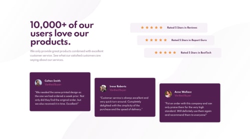
Responsive Mobile First Social Proof Section with CSS Grid and Flex

Solution retrospective
Hi everyone!
This is my 7th solution for Frontend Mentor! I tried hard on this one to use proper Semantic HTML, CSS Flexbox, and Grid. I also took a mobile first approach to this project, and I'm so glad that I did. After completing this one, I'm looking forward to going back and improving on my previous ones!
I would REALLY appreciate any feedback on:
- my use of any of the above
- how I can continue to improve my layouts for responsiveness
- how I can continue to improve my use of Semantic HTML
- how I can make my work accessible
- any best practices or improvements I can make
Thank you so much for any feedback. I really appreciate it!
Please log in to post a comment
Log in with GitHubCommunity feedback
- @dewslyse
Hello Brendan 👋! Awesome job on this challenge 🔥🔥. The page is nice and responsive. I'll be tackling this one soon and hope mine would be as good as yours.
You seem to have a horizontal scroll bar at
max-width: 1160px. I think losing themin-width: 100vwon thebodywould resolve that.Marked as helpful - @mghadieh
I submitted my solution for this challenge right after you on slack. I checked out your code and right away I saw on issue in my solution. I fixed it. Nice use of grid and flexbox. One thing, try and get the spacing right between the elements. For example, the difference in the heights of the testimonial cards in your solution is almost double of the design.


Join our Discord community
Join thousands of Frontend Mentor community members taking the challenges, sharing resources, helping each other, and chatting about all things front-end!
Join our Discord