@Yakub-Egamnazarov
Posted
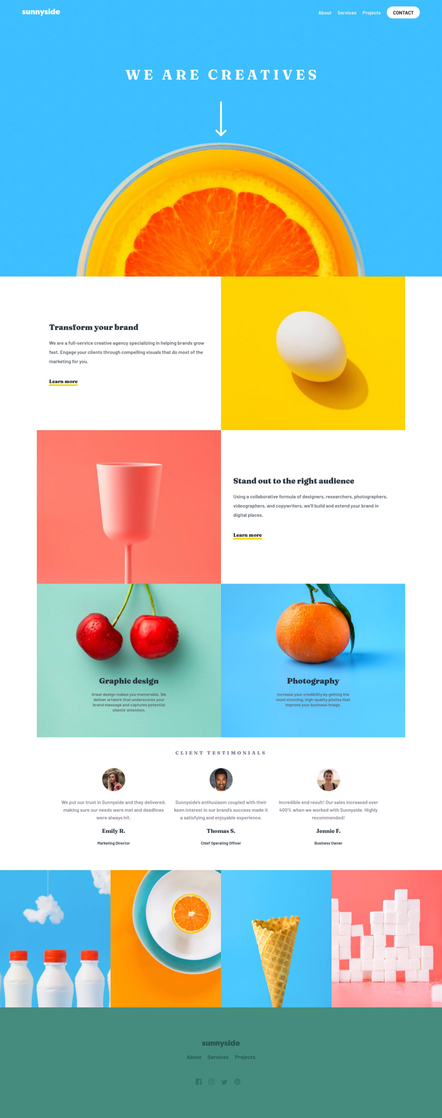
Hi, congratulation on your completion of the project, when checking online, I noticed several issues with the desktop and mobile versions.
- You could add some dynamic active states as in the design for the desktop version, it is basically made via <<:hover>> effect in CSS. For example, the contact button in the header's navigation bar, and learn more button in the transform section. This would add some dynamic effects to the page. Also in the footer section, all the links and social network links could be made with a hover state.
- For the mobile version it's been made a great job, and like the animation with the menu button, how it is turning to X. However, it seems there is some problem with learning more btn, when the display's width 375px. In order to make a yellow (and red) line under the link, you created a div element, however, it would be better is :before pseudo-element used, it is easy to control, and it belongs to the links themselves.
Good luck and cheers my friend.
Marked as helpful
@Svobyyy
Posted
@Yakub-Egamnazarov Thank you very much, I added hover states on the header and footer sections. I would appreciate your opinion on them, regarding the before and after pseudoclasses, I have used them a few times on this project and I even was using it on the line but Idk why but I didnt wrap the a tag and use ::after/::before on it but I made a new div. I noticed, when Im using google the X animation on mobile menu is bugging, the reason was that transform-origin was in the transition and not in the element. Again, thank you very much for your time and I appreciate it. (Didnt use the ::after on the line but I have fixed the problem, where it wasnt under the Learn more) I think it should be perfect now, without any problems or I just miss them so if you see any.

