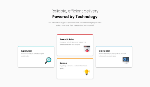
Responsive mobile-first design with added tablet layout

Solution retrospective
What do you think of the tablet layout that I decided to add?
Please log in to post a comment
Log in with GitHubCommunity feedback
- @zuolizhu
Hey Matthew,
I like the zig zag pattern you did on the tablet layout, very interesting 😆!
However, it feels a little bit off the center because of the pattern 🤔 (comparing the 4 cards stacked vertically on the mobile view and the three columns layout in the desktop view 👀).
I might do a plain 2x2 layout for the tablet. Or go for the zig zag pattern, but with a vertical guiding line crossing the center, something like this design: https://dribbble.com/shots/7287678-Milestone-Timeline-dashboard-UI-design
Anyway, you did a really nice work on this project🤩! Happy coding!🙌

Join our Discord community
Join thousands of Frontend Mentor community members taking the challenges, sharing resources, helping each other, and chatting about all things front-end!
Join our Discord