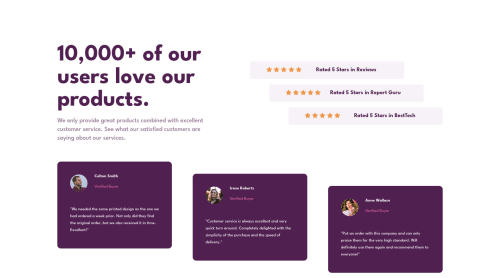
Responsive mobile-first solution with CSS Grid and Flexbox

Solution retrospective
- Do you see something about the responsive that I can improve?
- What would you have changed with respect to my solution?
If you have any advice you can give me, it would be very welcome.
Please log in to post a comment
Log in with GitHubCommunity feedback
- @correlucas
👾Hello @MatiDN, Congratulations on completing this challenge!
Great code and great solution! I’ve few suggestions for you that you can consider adding to your code:
You did a really good work here putting everything together, something you can improve its your code html markup and semantics. You can replace the
<div>that wraps each card with<article>you can wrap the paragraph with the quote with the tag<blockquote>this way you'll wrap each block of element with the best tag in this situation. Pay attention that<div>is only a block element without meaning.This article from Freecodecamp explains the main HTML semantic TAGS: https://www.freecodecamp.org/news/semantic-html5-elements/
✌️ I hope this helps you and happy coding!
Marked as helpful - @tossik8
You can add backgrounds


Join our Discord community
Join thousands of Frontend Mentor community members taking the challenges, sharing resources, helping each other, and chatting about all things front-end!
Join our Discord