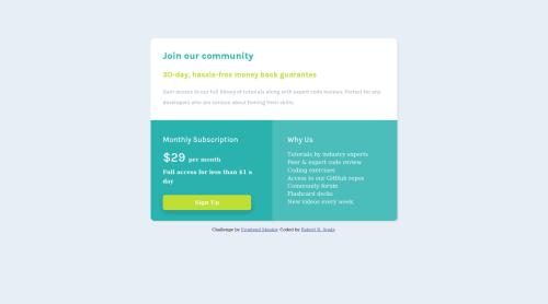
Responsive Mobile-First Solution with Flexbox

Solution retrospective
This is my first Front-End Mentor project using Flexbox and a Mobile-First workflow. I am currently using a Mobile-First workflow on other Front-End Mentor projects under development, but I'm not always finding it easy. I understand Mobile-First, and I've read books about it, but I'm so used to creating the wide-screen version first that it feels as though I'm working backwards now. Sometimes the mobile version comes out fine, but the wide-screen version is a mess, and I have to change the HTML5 section markup to accommodate both versions. Frequently, it's not as simple as changing 'flex-direction' from 'column' to 'row.' Everything appears to work well on both my laptop and my smartphone. I would appreciate any suggestions on improving my code as well as on how I can better use a Mobile-First workflow. Thank you.
Please log in to post a comment
Log in with GitHubCommunity feedback
No feedback yet. Be the first to give feedback on Robert Spatz's solution.
Join our Discord community
Join thousands of Frontend Mentor community members taking the challenges, sharing resources, helping each other, and chatting about all things front-end!
Join our Discord