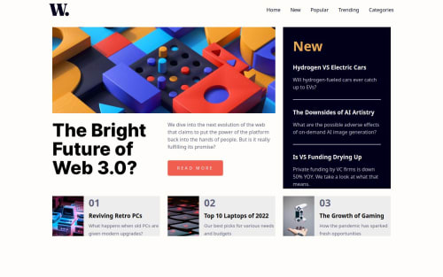
Submitted over 1 year agoA solution to the News homepage challenge
Responsive navbar and grids. Two separate grid containers.

@memominguez
Solution retrospective
What are you most proud of, and what would you do differently next time?
In the navbar styling, used a calc() for setting the inline padding (left - right). So the navbar fits acceptably into different desktop screen sizes.
I would try similar in future projects.
What challenges did you encounter, and how did you overcome them?Worked a grid solution with four areas which had to move around to make the whole page responsive. Plenty of styling code.
Had to figure out the areas' dimensions, in lack of access to a Figma.
What specific areas of your project would you like help with?Would like to compare with other grid solutions
Code
Please log in to post a comment
Log in with GitHubCommunity feedback
No feedback yet. Be the first to give feedback on Guillermo Dominguez's solution.
Join our Discord community
Join thousands of Frontend Mentor community members taking the challenges, sharing resources, helping each other, and chatting about all things front-end!
Join our Discord