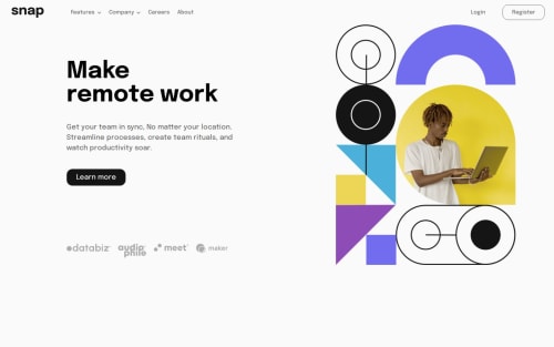
responsive navigation menu using css and Javascript

Solution retrospective
I got to learn the specific use of the differrent html tags instead of just repeating divs for each container. From this project i understood how to effectively use media queries and use javascript to make the media queries reponsive.
What challenges did you encounter, and how did you overcome them?The major issue i faced was with the positioning of the links in the navigation menu and also how differently the elements behave for desktop and mobile devices for example i think the hover for desktop gets converted to click for mobile devices. i ended up having to disable the hover for dropdown for my media query and increasing the width of the containers to properly modify the elements inside.
What specific areas of your project would you like help with?I have an issue with the javascript when i click on features to enable its dropdown menu. on clicking features it brings out the dropdown but when i click it again the dropdown doesn't disable until i click the company link to enable its dropdown then the features dropdown start working properly.
Please log in to post a comment
Log in with GitHubCommunity feedback
No feedback yet. Be the first to give feedback on Deji-Hb’s solution.
Join our Discord community
Join thousands of Frontend Mentor community members taking the challenges, sharing resources, helping each other, and chatting about all things front-end!
Join our Discord