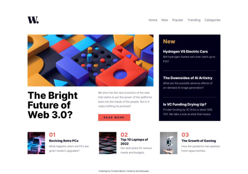
Responsive news homepage HTML/CSS/JS

Solution retrospective
I'm particularly proud of implementing the responsive navigation - creating a hamburger menu for mobile/tablet that smoothly transitions to a standard navigation bar on desktop. The mobile and tablet layouts came together faster than expected, which felt great after struggling with some of the desktop complexities.
What challenges did you encounter, and how did you overcome them?The desktop layout gave me the most trouble, specifically with the grid system for the bottom three articles. I spent a lot of time trying to get the images to scale properly with the text content, but there's still an awkward sizing issue between 1280px-1400px screen widths that I haven't fully resolved. The "New" stories section also doesn't scale well beyond 1440px, which is frustrating. Honestly, I reached a point where I needed to step back from the desktop version and move forward rather than get stuck in perfectionism.
What specific areas of your project would you like help with?I'd really like to revisit the desktop layout, particularly making the "New" stories section more fluid across larger screen sizes. The three-article grid at the bottom also needs work to handle the image-to-text proportions better across different breakpoints.
Please log in to post a comment
Log in with GitHubCommunity feedback
No feedback yet. Be the first to give feedback on Kyle Mulqueen's solution.
Join our Discord community
Join thousands of Frontend Mentor community members taking the challenges, sharing resources, helping each other, and chatting about all things front-end!
Join our Discord