Not Found
Not Found
Not Found
Not Found
Not Found
Not Found
Not Found
Not Found
Not Found
Not Found
Not Found
Not Found
Not Found
Not Found
Not Found
Not Found
Not Found
Not Found
Not Found
Not Found

Submitted

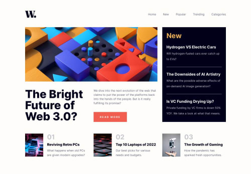
Responsive news homepage made with React, Grid and Flexbox
#accessibility#react#vite#semantic-ui
nataliaā€¢ 180

@nataliadgalindo

Desktop design screenshot for the News homepage coding challenge

This is a solution for...

  • HTML
  • CSS
  • JS
2junior
View challenge

Design comparison


SolutionDesign

Solution retrospective


Honestly tougher than I thought but interesting to learn more Grid. Anyway, the transitions between screen sizes is a little weird and my aside doesn't seem to go all the way down, overall there's some grey areas and mistakes that I can't quite pinpoint/fix so if you have any suggestions or tips, that'd be very appreciated, thanks!

Community feedback

Account Deleted

That is look so COOL where is the problem :)

little note: try to remove children of aside and bottom cards into its own component !

Marked as helpful

1

nataliaā€¢ 180

@nataliadgalindo

Posted

@DoctorLoo Thanks so much :)

To be honest, was just a little careless since its a small project for layout practice but ordinarily I make individual components. I'll fix it soon and thank you for your note :)

1

@VCarames

Posted

Hey there @nataliadgalindo! šŸ‘‹ Here are some suggestions to help improve your code:

Unfortunately, there a lot of things that need improvement on this challenge... have you done easier challenges?

  • This class="content-wrapper" is not needed and can be removed.
  • The logo should be outside of the nav but inside of the header. Its alt` tag should not be blank as it, it should state the company's name.
  • The nav toggle should be the first thing inside of the nav.
  • The navigation links need to be wrapped anchor elements for them to be interactive.
  • This class="grid-container" should be a main element.
  • The class="main-img" and class="main-heading" should both be wrapped inside the article element.
  • The h1 heading for this challenge is actually visually hidden and the "The Bright Future of Web 3.0?" is actually an h2 heading/
  • The "Read More" button should be an anchor element as selecting that button would most likely direct users to another page/section.

There are more things, I just didn't want to leave a massive paragraph... šŸ˜

If you have any questions or need further clarification, feel free to reach out to me.

Happy Coding! šŸ‘¾

0

Please log in to post a comment

Log in with GitHub
Discord logo

Join our Discord community

Join thousands of Frontend Mentor community members taking the challenges, sharing resources, helping each other, and chatting about all things front-end!

Join our Discord