Responsive NFT Preview Card – HTML & CSS

Solution retrospective
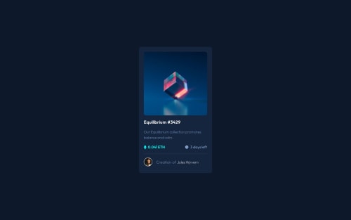
I'm most proud of how clean and visually accurate my solution is compared to the original design. I was able to match the layout, colors, and spacing using only HTML and CSS, and I kept the code organized and accessible. Next time, I’d like to improve the structure by using reusable utility classes or a CSS methodology like BEM to make scaling easier. I’d also explore adding keyboard interactivity for better accessibility.
What challenges did you encounter, and how did you overcome them?One of the main challenges was implementing the active state overlay (instead of a typical hover effect) since that was a strict requirement of the challenge. I solved this by applying an :active style on the .image-wrapper and showing the overlay accordingly. Another issue was ensuring semantic HTML and using appropriate aria roles for accessibility, which took a few iterations and testing with screen readers.
What specific areas of your project would you like help with?I’d appreciate feedback on:
Accessibility improvements (especially in how I used aria-label and role attributes).
Best practices for handling active states when hover isn’t allowed.
Suggestions on how to structure small UI components more modularly with plain HTML and CSS.
Please log in to post a comment
Log in with GitHubCommunity feedback
No feedback yet. Be the first to give feedback on Ishan Ahmad's solution.
Join our Discord community
Join thousands of Frontend Mentor community members taking the challenges, sharing resources, helping each other, and chatting about all things front-end!
Join our Discord