Skip to content
  • Unlock Pro
  • Log in with GitHub
Solution
Submitted over 2 years ago

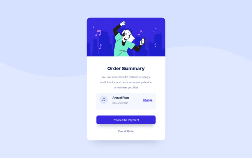
Responsive Order Summary

Ferdi Tondeur•100
@ferditondeur
A solution to the Order summary component challenge
View live sitePreview (opens in new tab)View codeCode (opens in new tab)

Solution retrospective


Tried not using fixed widths and heights as much. Still need to figure out the best use-cases for both flex and grid in these types of designs. Seems a combination worked for now. Was there a more efficient way I overlooked?

The top image had some overflow issues I couldn't seem to fix except for (in my opinion) bruteforcing it with a 'overflow: hidden' on the parent, which doesn't seem ideal.

I still feel like I design these things in a more roundabout way than necessary, so if anyone could share any insights, that would be great!

Code
Select a file

Please log in to post a comment

Log in with GitHub

Community feedback

  • Vanza Setia•27,715
    @vanzasetia
    Posted about 2 years ago

    Hi, Ferdi Tondeur! 👋

    In general, you should use flexbox for one direction layout either column or row. You should use the grid for two dimensions layout. Meaning, the layout requires the column and the row to be controlled.

    In this case, you make the <body> element as a flex container to put the card in the middle of the page.

    For the <main> element or the card element, you only need to set a max-width to prevent it from filling the entire page on large screen sizes. So, you should remove min-width, min-height, and max-height.

    For the height of the card, let the content controls the height of it.

    For the illustration image, it will be overflowing because the <span> is larger than the parent element—the <main> element—because of the border-radius. You are already doing great by setting overflow: hidden on the parent element.

    But, I recommend making the illustration a "real" image element. This way, you don't have to set height and other background properties. In other words, you will end up with less code.

    Also, you should rarely set any width or height. That does not mean you are using dynamic units such as percentages or viewport units, you can use them very often. I think the golden rule of responsive design is to let the content controls the size of the element whenever possible.

    I hope this helps. Happy coding! 😄

    Marked as helpful
  • Abdul Khaliq 🚀•72,380
    @0xabdulkhaliq
    Posted about 2 years ago

    Hello there 👋. Congratulations on successfully completing the challenge! 🎉

    • I have other recommendations regarding your code that I believe will be of great interest to you.

    HEIGHT 📐:

    • Use min-height: 100vh for body instead of height: 100vh. Setting the height: 100vh may result in the component being cut off on smaller screens.

    • For example; if we set height: 100vh then the body will have 100vh height no matter what. Even if the content spans more than 100vh.

    • But if we set min-height: 100vh then the body will start at 100vh, if the content pushes the body beyond 100vh it will continue growing. However if you have content that takes less than 100vh it will still take 100vh in space.

    .

    I hope you find this helpful 😄 Above all, the solution you submitted is great !

    Happy coding!

Join our Discord community

Join thousands of Frontend Mentor community members taking the challenges, sharing resources, helping each other, and chatting about all things front-end!

Join our Discord
Frontend Mentor logo

Stay up to datewith new challenges, featured solutions, selected articles, and our latest news

Frontend Mentor

  • Unlock Pro
  • Contact us
  • FAQs
  • Become a partner

Explore

  • Learning paths
  • Challenges
  • Solutions
  • Articles

Community

  • Discord
  • Guidelines

For companies

  • Hire developers
  • Train developers
© Frontend Mentor 2019 - 2025
  • Terms
  • Cookie Policy
  • Privacy Policy
  • License

Oops! 😬

You need to be logged in before you can do that.

Log in with GitHub

Oops! 😬

You need to be logged in before you can do that.

Log in with GitHub

How does the accessibility report work?

When a solution is submitted, we use axe-core to run an automated audit of your code.

This picks out common accessibility issues like not using semantic HTML and not having proper heading hierarchies, among others.

This automated audit is fairly surface level, so we encourage to you review the project and code in more detail with accessibility best practices in mind.

How does the CSS report work?

When a solution is submitted, we use stylelint to run an automated check on the CSS code.

We've added some of our own linting rules based on recommended best practices. These rules are prefixed with frontend-mentor/ which you'll see at the top of each issue in the report.

The report will audit all CSS, SCSS and Less files in your repository.

How does the HTML validation report work?

When a solution is submitted, we use html-validate to run an automated check on the HTML code.

The report picks out common HTML issues such as not using headings within section elements and incorrect nesting of elements, among others.

Note that the report can pick up “invalid” attributes, which some frameworks automatically add to the HTML. These attributes are crucial for how the frameworks function, although they’re technically not valid HTML. As such, some projects can show up with many HTML validation errors, which are benign and are a necessary part of the framework.

How does the JavaScript validation report work?

When a solution is submitted, we use eslint to run an automated check on the JavaScript code.

The report picks out common JavaScript issues such as not using semicolons and using var instead of let or const, among others.

The report will audit all JS and JSX files in your repository. We currently do not support Typescript or other frontend frameworks.

Oops! 😬

You need to be logged in before you can do that.

Log in with GitHub

Oops! 😬

You need to be logged in before you can do that.

Log in with GitHub