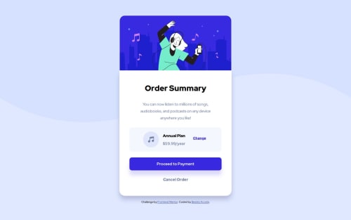
Responsive Order Summary Component

Solution retrospective
The most challenging part for me was making this a responsive layout while maintaining the background image in the correct position. Any pointers with that would be appreciated.
What specific areas of your project would you like help with?When using Chrome devtools I noticed that when using Nest Hub the top of my summary component is cut off. Any help with that?
I have updated my solution to fix this problem and other important code I forgot to add.
Please log in to post a comment
Log in with GitHubCommunity feedback
- P@dar-ju
Hi, Adritriz!
Great job!
The block is cut off because your html page is centered vertically and if it doesn't fit the screen, like in your device, it is cut off. Remove the line from the html styles -
justify-content: center;and it should be fine.In general, I don't recommend styling html, it is better to create a separate container for this block.
Also check some elements:
- Change and Cancel Order elements are links or buttons, use the <a> tag for them
- The Proceed button should be clear that it can be clicked, add
cursor: pointer; - Move the image to main, all the main content should be in main, excluding header and footer
The rest is great, good luck with the development!

Join our Discord community
Join thousands of Frontend Mentor community members taking the challenges, sharing resources, helping each other, and chatting about all things front-end!
Join our Discord