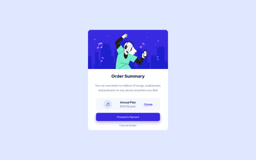
Responsive order summary component

Solution retrospective
Hi everyone, I appreciate if you could give me feedback on my project. Feedback always help and motivate me to keep learning. Cheers!
Please log in to post a comment
Log in with GitHubCommunity feedback
- @denielden
Hi Rina, great work on this challenge! 😉
Here are a few tips for improve your code:
- for add the top image in the background just put more specific background properties to the body:
background: url("../img/pattern-background-desktop.svg") no-repeat top center; background-size: contain; background-color: #e0e8ff;- centering with
absolutepositioning is now deprecated, it uses modern css likeflexbox or grid - remove all
marginfrom.containerclass because with flex they are superfluous - use flexbox to the body to center the card. Read here -> best flex guide
- after, add
min-height: 100vhto body because Flexbox aligns child items to the size of the parent container - add
transitionon the element with hover effect - instead of using
pxuse relative units of measurement likerem-> read here
Overall you did well 😁 Hope this help!
Marked as helpful - @AlazarG19
nice solution every thing is perfect but try giving margin or padding between the button and description and try increasing the card size so that it can be exact i would advice you to use the tool perfect pixel to create the exact solution download the perfect pixel extension and it would be helpful trust me
- @FluffyKas
Hiya,
It seems really good! I suggest instead of using that very bright purple colour for your button hover (Proceed to payment button), try keeping the original colour but with reduced opacity (0.8 or something). At the moment, this bright colour makes it super hard to read the text inside.


Join our Discord community
Join thousands of Frontend Mentor community members taking the challenges, sharing resources, helping each other, and chatting about all things front-end!
Join our Discord