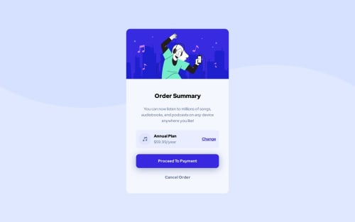
Responsive Order Summary | React + Vite | Tailwind | Mobile First

Please log in to post a comment
Log in with GitHubCommunity feedback
- @sliyarli
HTML:
Your HTML structure seems to be well-organized and follows the standard structure with the
<head>and<body>sections. The use of the<meta>tags and<link>for the favicon and stylesheet is appropriate.The structure within the
<body>is nicely divided into sections using<div>elements. This can help with styling and layout control.CSS:
Your CSS is well-organized and utilizes utility classes for styling. This approach helps to keep your code clean and maintainable.
I noticed you've used custom properties (CSS variables) for color values, which is a good practice for consistent theming.
You've used utility classes for various styling properties like flexbox (
flex,flex-col), colors (bg-blue-neutral-pale,bg-blue-primary-bright), padding (p-3,p-4), font sizes (text-2xl,text-base), font weights (font-bold,font-medium), and more. This approach can make your styles more reusable and easier to manage.You've also used media queries to adjust styles for different screen sizes (
@media (min-width: 640px)). This is important for creating responsive designs.Overall:
Your project looks well-structured and nicely styled. You've used utility classes effectively to create a responsive design that adapts well to different screen sizes. Keep up the good work, and feel free to explore more complex layouts and interactions as you continue to develop your front-end skills!
Marked as helpful

Join our Discord community
Join thousands of Frontend Mentor community members taking the challenges, sharing resources, helping each other, and chatting about all things front-end!
Join our Discord