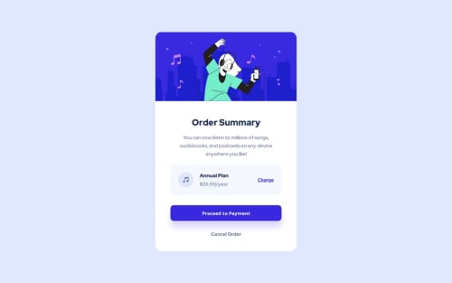
Skip to content
  • Unlock Pro
  • Log in with GitHub
Solution
Submitted over 1 year ago

Responsive Order Summary View

bem
Alok Acharya•100
@az0r234
A solution to the Order summary component challenge
View live sitePreview (opens in new tab)View codeCode (opens in new tab)

Solution retrospective


I found it very difficult to make it responsive, if you have any suggestions/ideas on how I can write better and scalable css to make it responsive please provide it!

Code
Select a file

Please log in to post a comment

Log in with GitHub

Community feedback

  • Yonten•340
    @yozidst
    Posted over 1 year ago

    Hi there 👋

    Great Job on the Challenge!

    In terms of responsiveness, you can use the clamp function on the width of the container to perform scalable layouts.

    eg.

    @media only screen and (max-width: 1440px) and (min-width: 375px) {
        ...
        .orderSummary-card {
             width: clamp(350px, 30vw, 32.7rem );  // you can play around with the values. 
             ...
          }
         ...
    }
    
    • the first value is the smallest case scenario.
    • the middle value that occurs the most often and resizes depending on the screen width
    • the last value is the max-width you are comfortable with for scaling.

    Also, for your orderSummary-card, you listed two ways to center the container inside the main. Try to stick to one.

    Hope it was helpful! Keep going!

    Marked as helpful
  • Kimo Spark•2,190
    @kimodev1990
    Posted over 1 year ago
    • It's better in the future to avoid giving your design sizes definite values , It's better to give percentage values to make your design responsive with viewport dimensions. For example, you could assign class .orderSummary-card width: 30%; as you like it to be, So the width of your card will be 30% in relative to body width. This helps your design to be flexible growing and shrinking.
    • Adding up to the previous point, If you need to assign definite values, you could check on and use clamp ( ) method ( font-size, width, margins, paddings, etc. ) ,so your design sizes will change according to the viewport dimensions and will be suitable for any device layout. ( Responsive Design )

    Hope you find this Useful & Helpful.

    Other than that, Nice work & keep Going on.

    Marked as helpful

Join our Discord community

Join thousands of Frontend Mentor community members taking the challenges, sharing resources, helping each other, and chatting about all things front-end!

Join our Discord
Frontend Mentor logo

Stay up to datewith new challenges, featured solutions, selected articles, and our latest news

Frontend Mentor

  • Unlock Pro
  • Contact us
  • FAQs
  • Become a partner

Explore

  • Learning paths
  • Challenges
  • Solutions
  • Articles

Community

  • Discord
  • Guidelines

For companies

  • Hire developers
  • Train developers
© Frontend Mentor 2019 - 2025
  • Terms
  • Cookie Policy
  • Privacy Policy
  • License

Oops! 😬

You need to be logged in before you can do that.

Log in with GitHub

Oops! 😬

You need to be logged in before you can do that.

Log in with GitHub

How does the accessibility report work?

When a solution is submitted, we use axe-core to run an automated audit of your code.

This picks out common accessibility issues like not using semantic HTML and not having proper heading hierarchies, among others.

This automated audit is fairly surface level, so we encourage to you review the project and code in more detail with accessibility best practices in mind.

How does the CSS report work?

When a solution is submitted, we use stylelint to run an automated check on the CSS code.

We've added some of our own linting rules based on recommended best practices. These rules are prefixed with frontend-mentor/ which you'll see at the top of each issue in the report.

The report will audit all CSS, SCSS and Less files in your repository.

How does the HTML validation report work?

When a solution is submitted, we use html-validate to run an automated check on the HTML code.

The report picks out common HTML issues such as not using headings within section elements and incorrect nesting of elements, among others.

Note that the report can pick up “invalid” attributes, which some frameworks automatically add to the HTML. These attributes are crucial for how the frameworks function, although they’re technically not valid HTML. As such, some projects can show up with many HTML validation errors, which are benign and are a necessary part of the framework.

How does the JavaScript validation report work?

When a solution is submitted, we use eslint to run an automated check on the JavaScript code.

The report picks out common JavaScript issues such as not using semicolons and using var instead of let or const, among others.

The report will audit all JS and JSX files in your repository. We currently do not support Typescript or other frontend frameworks.

Oops! 😬

You need to be logged in before you can do that.

Log in with GitHub

Oops! 😬

You need to be logged in before you can do that.

Log in with GitHub